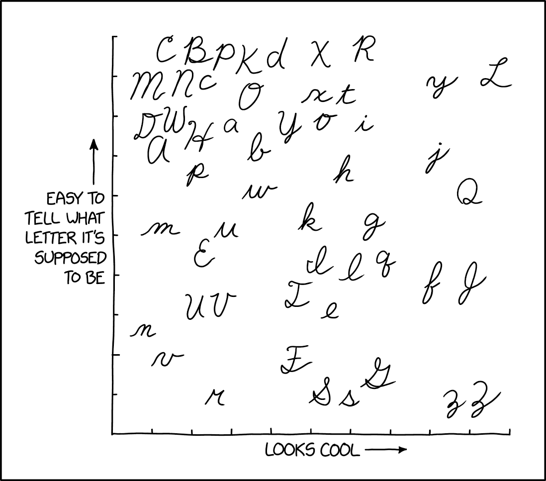
This Q really looks nearly identical to a 2. So, for many of us in 3rd grade, we wrote about the 2ueen who 2uestioned why ducks say 2uack. It was 2uite difficult.
I don’t think I’ve ever seen someone write a J with the top extending beyond the root. The inward curvature of the foot I think is because it loops around and connects with the «a» afterwards (that connection is either very faint or not visible in the picture)
IIRC, cursive capital Q is supposed to start way down, so that it’d look like an O with a broken infinity symbol in its butt, like this:
The direction of the strokes in the image is not how I learned it, though. Stroke 1 for the capital starts where stroke 2 starts, but going clockwise until just past where it starts, then smoothly start the second stroke (same direction as shown in the image).
However, I can see how it can look like a more flowy 2 and how people can say “yeah, that’s a capital Q.” Heck, cursive lowercase r barely looks like an r but people kinda get it.
Oh, yeah! It can vary from place to place and even from school to school even in the same place! There were even people saying that they can guess from which school someone graduated from based on how they do cursive. I think that’s just nuts.
My cursive nowadays is just reserved for when I really need to write fast, and would tend towards some kind of a personal shorthand than any sort of legibility. 😅
It’s there, almost all the way to the right, about 1/3 from the top.
That’s a different Q.
This Q really looks nearly identical to a 2. So, for many of us in 3rd grade, we wrote about the 2ueen who 2uestioned why ducks say 2uack. It was 2uite difficult.
This one. 2uentin and Jammy
Isn’t it Tammy?
That’s a very J-shaped T.
Yep! Now look for the capital J in the xkcd image, hehe.
There isn’t one, is there?
There is, actually: far right, about 1/3 the way up, below the obvious Q.
I thought that was a lowercase f. Doesn’t look anything like the cursive J we learned as kids.
Lowercase f is to the left of it for extra confusion.
My mum’s name started with J, so I have seen that style of J often
It’s the one next to the lowercase f, to the right of it
I don’t think I’ve ever seen someone write a J with the top extending beyond the root. The inward curvature of the foot I think is because it loops around and connects with the «a» afterwards (that connection is either very faint or not visible in the picture)
IIRC, cursive capital
Qis supposed to start way down, so that it’d look like anOwith a broken infinity symbol in its butt, like this:The direction of the strokes in the image is not how I learned it, though. Stroke 1 for the capital starts where stroke 2 starts, but going clockwise until just past where it starts, then smoothly start the second stroke (same direction as shown in the image).
However, I can see how it can look like a more flowy
2and how people can say “yeah, that’s a capital Q.” Heck, cursive lowercaserbarely looks like anrbut people kinda get it.Perhaps in your school. When I was in grade school learning cursive, the Q started high and looked like a 2.
I’m actually glad if they changed it.
These days, I avoid writing, but can do cursive, and will aim more for recognizable upper-case letters than standards.
Oh, yeah! It can vary from place to place and even from school to school even in the same place! There were even people saying that they can guess from which school someone graduated from based on how they do cursive. I think that’s just nuts.
My cursive nowadays is just reserved for when I really need to write fast, and would tend towards some kind of a personal shorthand than any sort of legibility. 😅
Not only did it look like a 2 when I learned it, there was a Ramona book where she liked the cursive Q because it looked like a 2.