
- cross-posted to:
- [email protected]
- [email protected]
- cross-posted to:
- [email protected]
- [email protected]
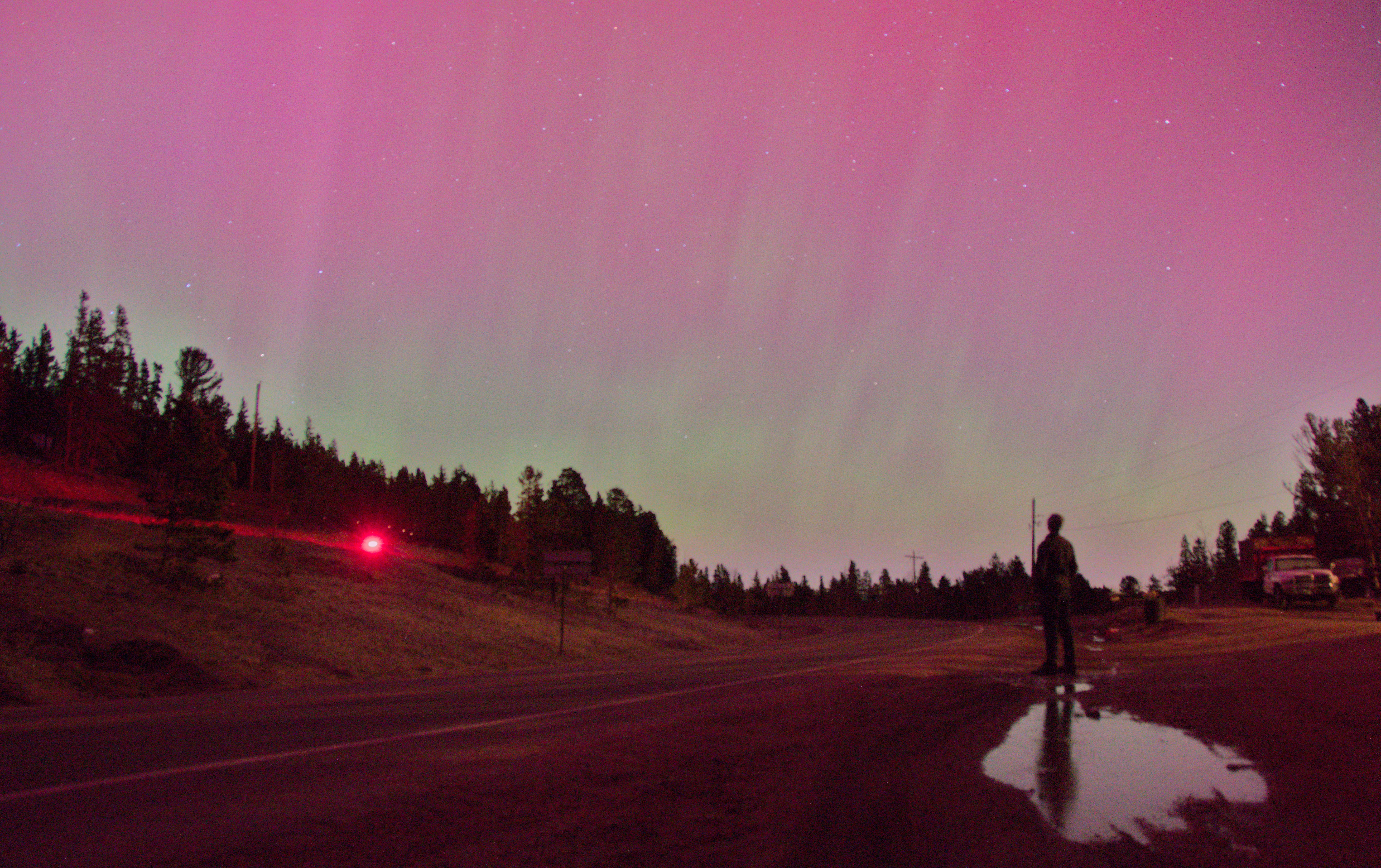
cross-posted from: https://lemmy.world/post/15289745
As seen from Colorado, USA close to midnight (May 11th, 2024).
cross-posted from: https://lemmy.world/post/15289745
As seen from Colorado, USA close to midnight (May 11th, 2024).
Edit: somehow the picture looks super compressed, I’ll try to upload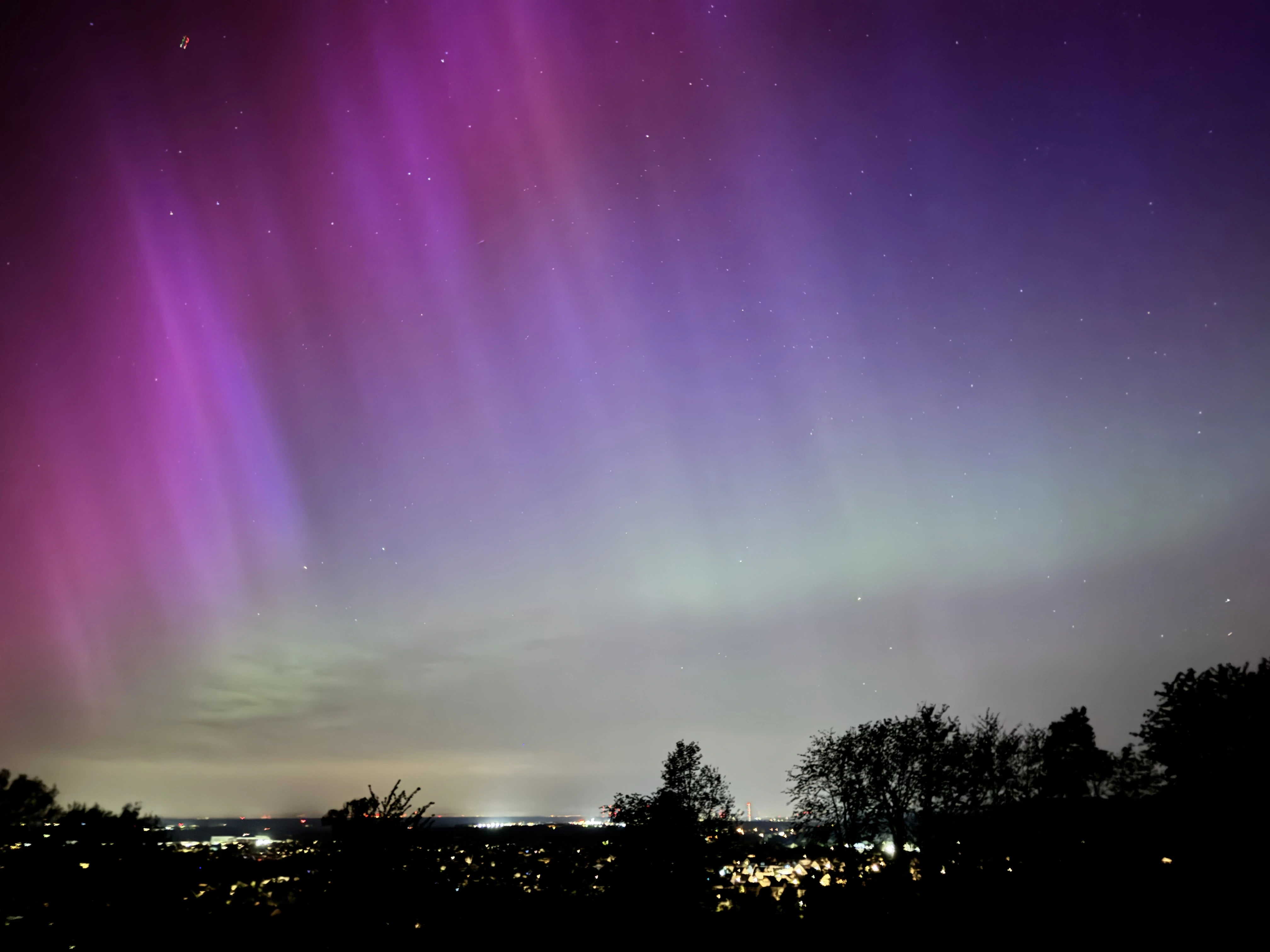
Gorgeous view!
Nice!
Those still look a little too saturated to me, but I wasn’t in your locale, did it look like that to your eye?
What I saw was more pastel-like than this - less contrast, softer tones.
Yeah it probably iPhones post processing 😅 And that was not visible like that to the naked eye. At max the green/turquoise veil at the bottom. Sometimes a little reddish purple.