In that case I as your student wouldn’t accept F- as a grade, because you didn’t see the original flag with three pigeons and a blue line in the middle. But ok.
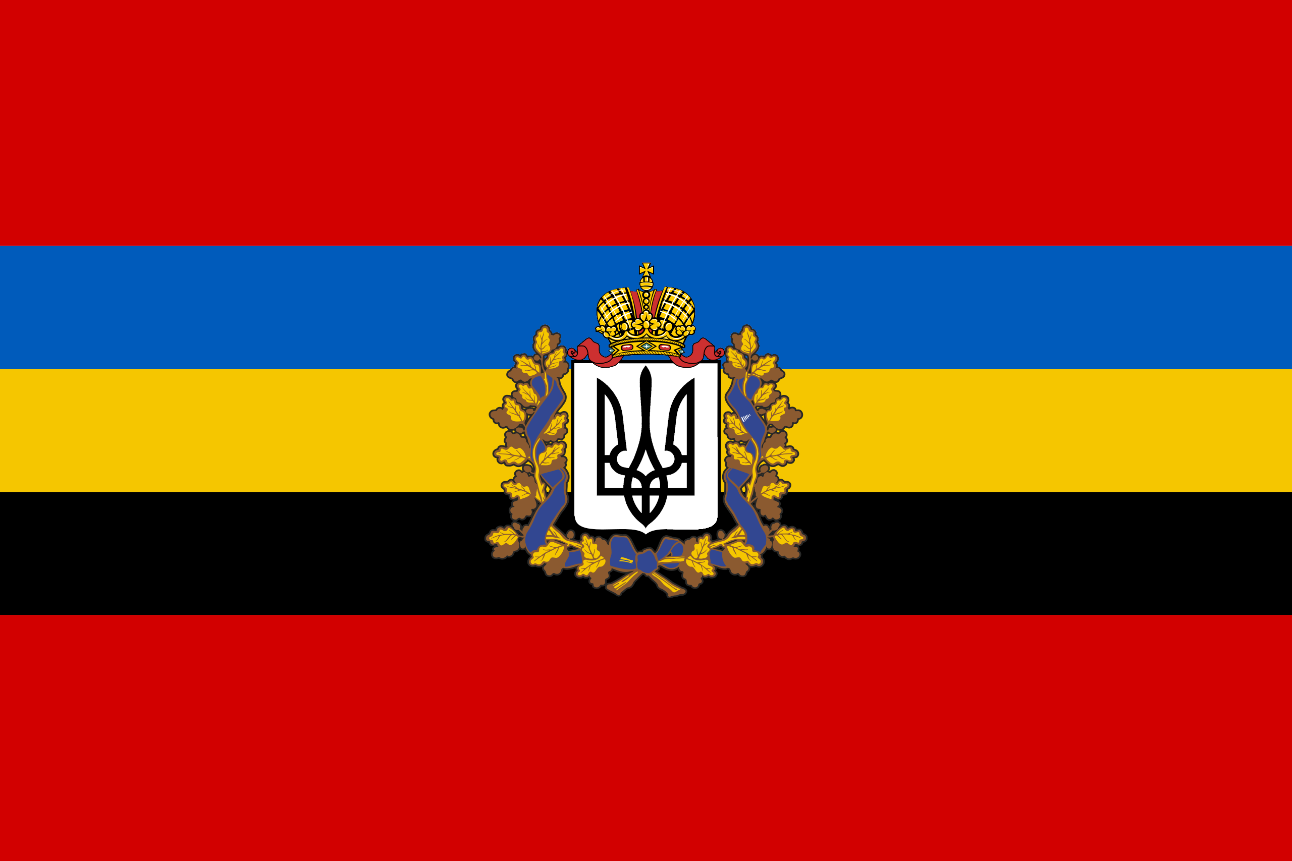
I agree. It could work if the emblem was simplified, but it’s a bit too complex right now. Not F- level though, I’d say C; the colours are unique with meaning, and the icon in the middle is striking and recognizable.
I agree. There are way too many clashing colors. It would be better if they reduced the number of colors. I could even go with reduced colors and the crest.


That emblem brings this from a solid B+ flag to F-
Its not a bad design, but those don’t belong on flags.
Without it many personal wouldn’t have recognized that it’s not the original flag.
Intresting. I’ll be honest, I have zero knowlage about the new flag or the nation (which I should fix…)
I just judged the flag as a flag.
In that case I as your student wouldn’t accept F- as a grade, because you didn’t see the original flag with three pigeons and a blue line in the middle. But ok.
I personally like emblems, icons and heraldry on flags. Without them, flags are often enough just bars of colors.
I agree. It could work if the emblem was simplified, but it’s a bit too complex right now. Not F- level though, I’d say C; the colours are unique with meaning, and the icon in the middle is striking and recognizable.
I agree. There are way too many clashing colors. It would be better if they reduced the number of colors. I could even go with reduced colors and the crest.