It’s hysterical because the conservatives in the South are always saying how those pansy liberals wouldn’t know a hard day’s work if it hit them in the head. And here you have evidence that many of those states are among the worst and the rest are orange.
The hardest working states are the ones right down the middle, from North Dakota to Texas. The least hardworking are generally the northeast (excepting the redder states of NH and ME) and west coast.
Somewhat unsurprising if you realize that most of the states down the middle have some of the lowest unemployment rates in the nation–e.g., North Dakota has an unemployment rate under 2%, whereas states like California, Washington, and New York have some of the highest.
Hardest working also factors in rates of overtime or multiple jobs (i.e., average hours worked per week), so realistically you want to be somewhere like Mass or Vermont (and others) that have both low unemployment and reasonable weekly hours.
That makes those states less “hardworking,” but I would bet the standard of living/happiness indices are higher in those states. Regardless, by these metrics and in general, red states do work more hours and have more of their state’s people gainfully employed.
I think you have that backward. The red is showing the higher percentage of people who exercise. Which if the case, states around Mississippi exercises the most, while those in Washington and Oregon exercise least. This could suggest those those in warmer climates exercise more.
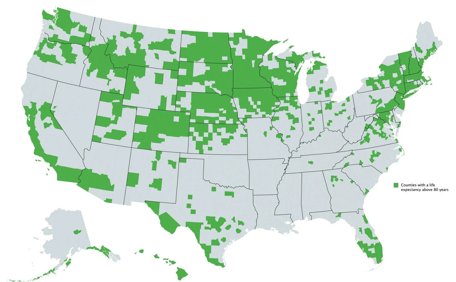
The first map shows life expectation over 80+, I believe to correlate more with affluence. Basically the more money you have, the higher the chance of living longer
No, it’s a map of what percent say they don’t exercise at all. I should have included the legend and title, but I’ve corrected the verbiage in the original post.
Are you of the opinion that north dakota, south dakota, Vermont, New Hampshire, etc are filled with wealthy people? I know you want to hate rich people, which is great, but that doesn’t seem to be the whole story here.
No, it’s a map of what percent say they don’t exercise at all. I should have included the legend and title, but I’ve corrected the verbiage in the original post.
Well, yeah ok. It’s understandable now that you fixed the wording. Why would I hate rich people? Why are you making such an assumption? It’s absolutely wrong anyway.

It’s basically where people exercise more and/or have an outdoors-y culture.
Levels of sedentary lifestyle by state:
If that map was more granular, I bet it would match very closely.
Lazy ass Rhode Islanders.
It’s hysterical because the conservatives in the South are always saying how those pansy liberals wouldn’t know a hard day’s work if it hit them in the head. And here you have evidence that many of those states are among the worst and the rest are orange.
The hardest working states are the ones right down the middle, from North Dakota to Texas. The least hardworking are generally the northeast (excepting the redder states of NH and ME) and west coast.
Somewhat unsurprising if you realize that most of the states down the middle have some of the lowest unemployment rates in the nation–e.g., North Dakota has an unemployment rate under 2%, whereas states like California, Washington, and New York have some of the highest.
Hardest working also factors in rates of overtime or multiple jobs (i.e., average hours worked per week), so realistically you want to be somewhere like Mass or Vermont (and others) that have both low unemployment and reasonable weekly hours.
That makes those states less “hardworking,” but I would bet the standard of living/happiness indices are higher in those states. Regardless, by these metrics and in general, red states do work more hours and have more of their state’s people gainfully employed.
Thanks for this info! I really appreciate learning more.
I think you have that backward. The red is showing the higher percentage of people who exercise. Which if the case, states around Mississippi exercises the most, while those in Washington and Oregon exercise least. This could suggest those those in warmer climates exercise more.
The first map shows life expectation over 80+, I believe to correlate more with affluence. Basically the more money you have, the higher the chance of living longer
No, it’s a map of what percent say they don’t exercise at all. I should have included the legend and title, but I’ve corrected the verbiage in the original post.
Are you of the opinion that north dakota, south dakota, Vermont, New Hampshire, etc are filled with wealthy people? I know you want to hate rich people, which is great, but that doesn’t seem to be the whole story here.
Well, yeah ok. It’s understandable now that you fixed the wording. Why would I hate rich people? Why are you making such an assumption? It’s absolutely wrong anyway.