@FUCKERM to internet [email protected]English • 8 months agoFreedom from advertising...lemmy.worldimagemessage-square25fedilinkarrow-up1910arrow-down111
arrow-up1899arrow-down1imageFreedom from advertising...lemmy.world@FUCKERM to internet [email protected]English • 8 months agomessage-square25fedilink
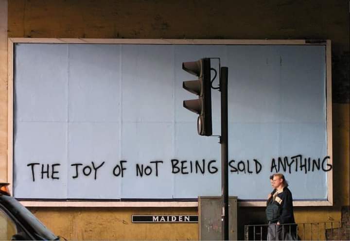
minus-squareJamesBeanlinkfedilink17•8 months agoYo anyone who ever freehanded a cake decoration or an event poster knows the struggle.
minus-squareglennglog22linkfedilink9•8 months agoWell it’s either that or awkwardly squishing the G. I think the overspray is the lesser of two evils
minus-square@[email protected]linkfedilinkEnglish5•8 months agoOr just startig the sentence at the left edge and not leaving about the space you’d need for the G unused on the left Don’t gotta indent graffiti
minus-squareglennglog22linkfedilink5•8 months agoForesight is for losers. Smell ya later alligators. butchers a guitar solo, falls off the skateboard and lands on the tailbone
minus-squareivanafteralllinkfedilink2•8 months agoOr there’s always the slightly sloping downward G. Ideally, you’d realize sooner and compensate. But I’d prefer a careful, squished I-N-G.
minus-square@[email protected]linkfedilinkEnglish4•8 months agoI like it. Shows the message outside of the confines of the original space. Also shows that even though it’s messier, less prepared and curated, it’s still preferred.
minus-square@[email protected]linkfedilinkEnglish3•8 months agoCame here to say this. So close to being all inside the border. So close…

The oversprayed G, REALLY!? Come on.
Yo anyone who ever freehanded a cake decoration or an event poster knows the struggle.
To begin with, a big-ass H!
Well it’s either that or awkwardly squishing the G. I think the overspray is the lesser of two evils
Or just startig the sentence at the left edge and not leaving about the space you’d need for the G unused on the left
Don’t gotta indent graffiti
Foresight is for losers. Smell ya later alligators.
butchers a guitar solo, falls off the skateboard and lands on the tailbone
Or there’s always the slightly sloping downward G. Ideally, you’d realize sooner and compensate. But I’d prefer a careful, squished I-N-G.
I like it. Shows the message outside of the confines of the original space. Also shows that even though it’s messier, less prepared and curated, it’s still preferred.
Came here to say this. So close to being all inside the border. So close…