
- cross-posted to:
- [email protected]
- cross-posted to:
- [email protected]
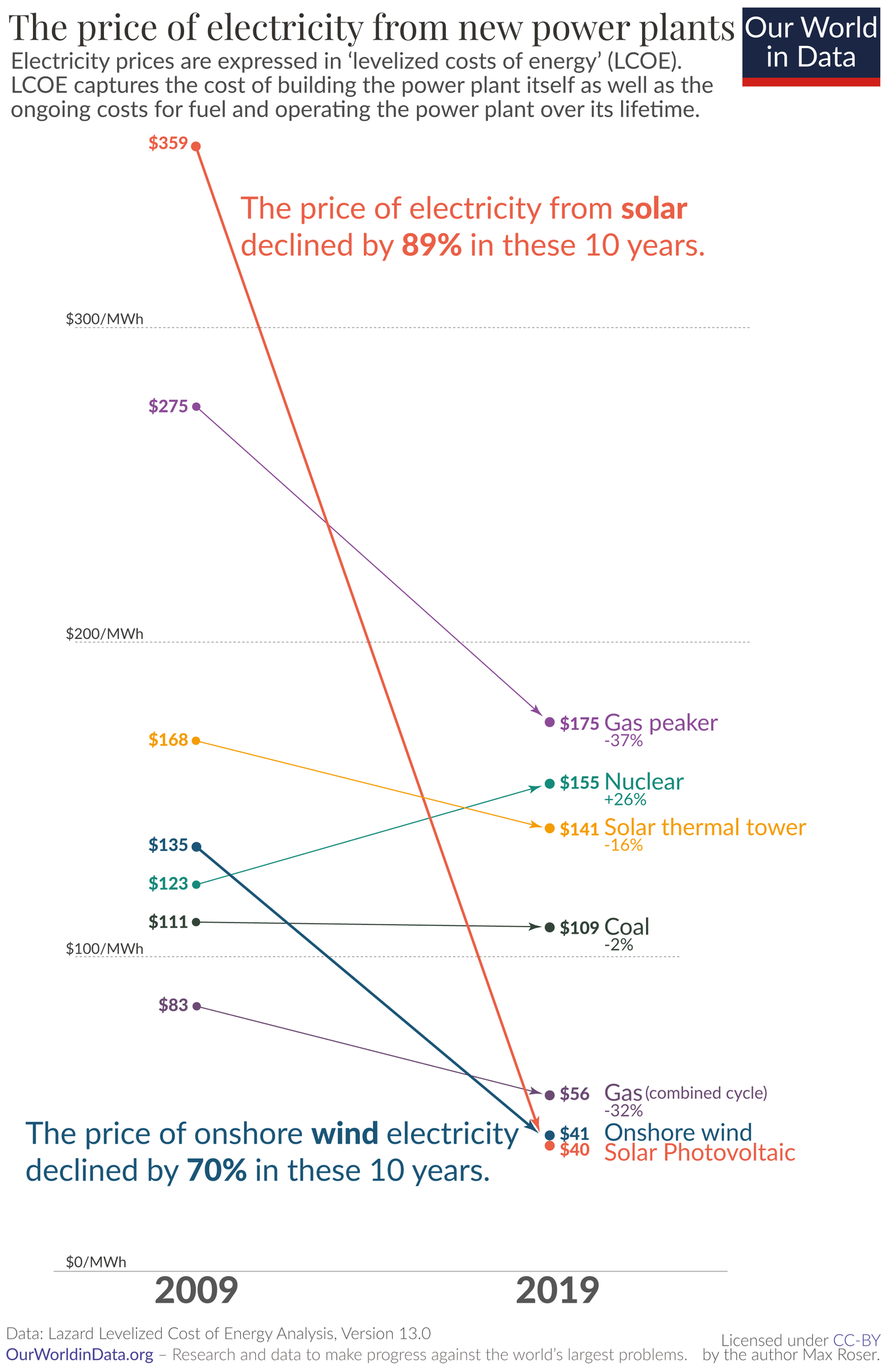
Solar now being the cheapest energy source made its rounds on Lemmy some weeks ago, if I remember correctly. I just found this graphic and felt it was worth sharing independently.
Solar now being the cheapest energy source made its rounds on Lemmy some weeks ago, if I remember correctly. I just found this graphic and felt it was worth sharing independently.
Without saying anything about politics, environment, or source:
Why, for the love of Satan, does this graph have only 2 data points per source?
Why use a line chart 📉 for that?
This is clear bar chart territory 📊.
I know it’s not ideal, but a bar chart design could either focus on the difference over time for each source, or the difference between sources at each time. This plot gives a good representation of both the differences between sources and the change in time for each source. It really drives home how far solar prices have fallen relative to other sources and in absolute terms.
The cost of the panels themselves doesn’t seem to have gone down nearly that much.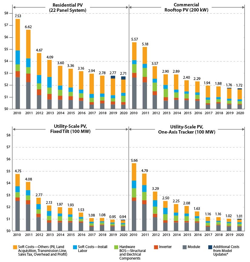
OP’s data is LCOE, which takes into account much more than $/MW. Rather importantly, expected operating liftetime is a major component (and historically THE major economic downside of PV).
IIRC, LCOE is calculated for utility-scale solar, which has seen a 500% decrease according to your chart.
Finally, Neither chart specifies, but if OP’s is in constant dollars and yours isn’t that would explain a lot as well.