- cross-posted to:
- [email protected]
- [email protected]
- cross-posted to:
- [email protected]
- [email protected]
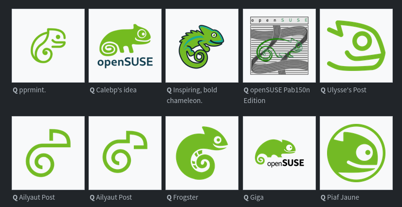
The openSUSE community’s logo contest submission phase is now complete and voting for the logos has begun.
This competition marks a pivotal moment for openSUSE and the voting goes until Dec. 10.
Before making any selections, people are encouraged to visit en.opensuse.org/Logocontest and view the logos before voting.
The number of submissions speaks volumes about the community’s enthusiasm and engagement with 18 submissions for Kalpa, 24 submissions for Slowroll, 21 submissions for Leap, 32 submissions for Tumbleweed and an impressive 36 submissions for a potential new openSUSE logo.


Alright, as a preface I have already voted, and I feel the survey probably could have been organized much better.
Here are my personal takeaways on the entries.
Overall, I think this is a great initial survey, and I look forward to seeing the results, and what comes next.