
- cross-posted to:
- [email protected]
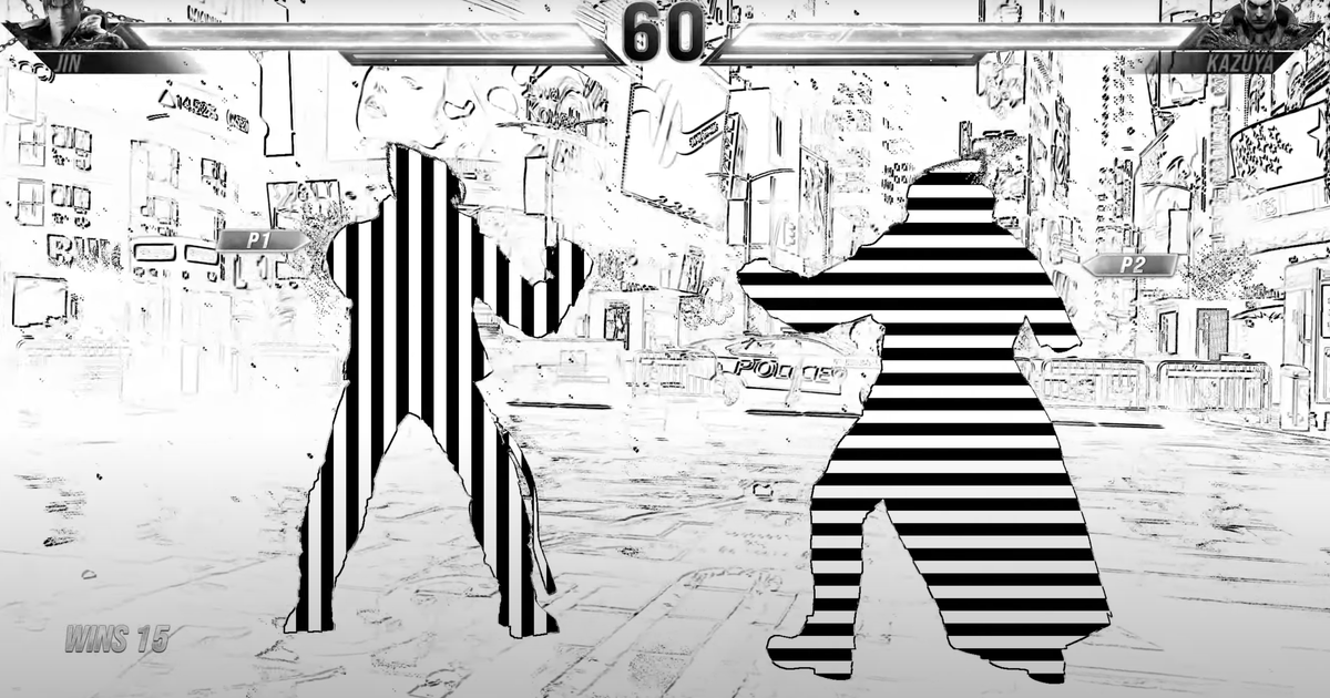
For those not up to date its exactly the filter in the thumbnail. The idea is interesting, to separate characters by something other than hue for players. It just seems there is a better, less visually assaulting way to do it. I don’t have epilepsy, but if you do don’t watch that video.
There are better, less visually assaulting ways to do it. Several of them are in Tekken 8. There are like, twenty filter options. This is one of them. Even the “concerned comments” acknowledge that, and their only angle is “this one might cause seizures in people who elect to try it, and that’s dangerous.”
I mean, it looks like it can kill people and it makes the game almost unplayable. So why put it in is the question.
It looks like it would be really good for computer vision trying to play the game via AI
So its a mode designed for OpenAI’s Universe?
Edit: this sub is a bunch of angry crabs in a bucket.
I’d imagine this is a pretty damn good way to help someone with poor vision, not necessarily color blindness, make out two separate silhouettes.
That filter is just one of the vision related accessibility options.
Is there a visual impairment where silhouettes with moving textures are more easily seen? I watched the video and am genuinely curious as to the actual purpose. I feel like this is meant to be fun without looking it up at all. The article was also heavily biased against it for some reason it seemed.
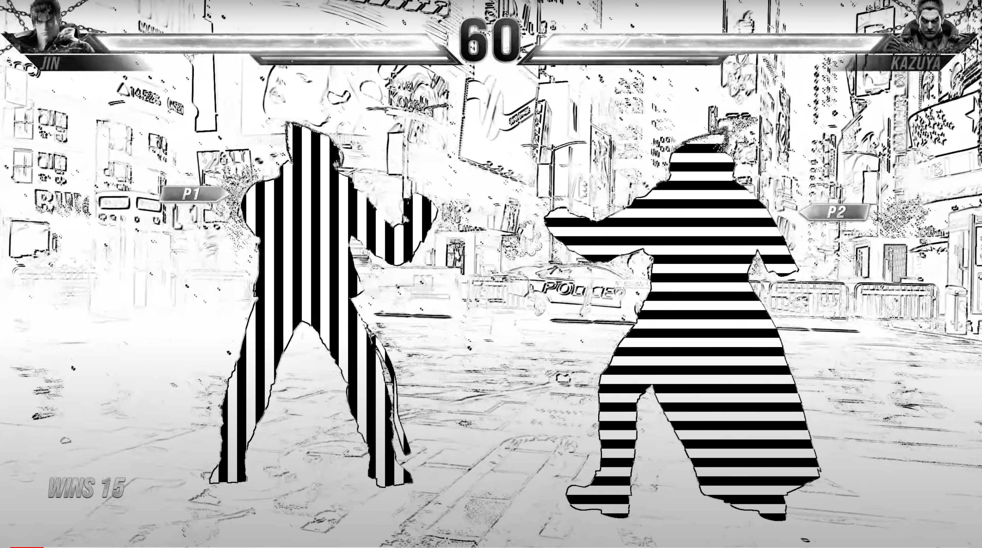
I’m not an expert, but the purpose of this filter is for people who are all but blind. And while it definitely looks trippy, it makes sense. Black/white is the highest possible contrast, which is important for people who, y’know, can’t really see that well. And the stripes are anchored in place, the character outline just moves over them, meaning that so long as someone can see the difference between the vertical and horizontal stripes, even vaguely, it’s difficult for them to lose which is which when everything is moving since the pattern never moves
Gonna need a summary, those ads are too obnoxious
Here’s the image from the article:
https://assetsio.reedpopcdn.com/Screenshot-2023-12-31-at-18.47.11.png
And here is the video which they advise you should avoid for epilepsy reasons.
It’s almost like they tried to find the worst idea as some type of internal joke
I think if the vertical lines were centered by the characters centre rather than the character being a window into “the lines behind” (can’t think of a better way to describe it) it would look way better. The horizontal one doesn’t seem to have the same issue, except when moving vertically but that doesn’t happen as egregiously as moving horizontally, so for the left player it’s more apparent.
Did they bother asking anyone with colour blindness to test this?
It’s not meant for colour blindness
I can’t tell if that character is close to me or far away!
“You’re holding it wrong” is a very poor response to “Your imagery might kill people.”
The idea behind this particular filter is admirable. It even highlights the importance of silhouettes in basically all aspects of game design. But wow is it a bad idea to make it that high-contrast and that high-frequency. Use some sinusoidal waves instead of instant black-to-white transitions. Or hey, make one character grey-and-black, and the other grey-and-white, against a grey-and-scribbles background.
You want it to be playable via the reflection off a Christmas ornament in the house next door, without killing anyone who’s sitting six inches from the screen.
High frequency? The lines don’t move at all. Just the masking of the player above them. There’s literally no frequency rate at which they are changing.
Image domain, not time domain. A high-frequency signal in time may rapidly go from very high values to very low values. A high-frequency image in space may rapidly go from very bright to very dark.
You should look up how JPEG uses the Discrete Cosine Transform, because it is unreasonably cool. Nearly all modern lossy compression is based on intense cheating in image frequency domains.
I felt like I was having a seizure trying to read the article. Why was every thing repeated 2 or 3 times?
How NOT to help people with colour blindness. I’m partially convinced that this must have been the creators personal artsy filter they wanted an excuse to implement
This isn’t for color blindness, it’s for normal blindness.
The kind where you are legally blind but can still make out shapes. The stripes are a clearer way to help such a person make out two separate silhouettes.


