The Original Series & The Animated Series
- opening titles: Star Trek BT italic (sometimes labeled as “Final Frontier Old Style” or “Horizon”) | https://www.azfonts.net/fonts/startrek-bt/regular-247841
- credits: Star Trek BT regular (sometimes labeled as “Final Frontier Old Style” or “Horizon”) | https://www.azfonts.net/fonts/startrek-bt/regular-247841
TOS movies
- opening titles: Star Trek Film BT* (sometimes labeled as “Final Frontier” or “Galaxy”) | https://www.azfonts.net/fonts/startrek-film-bt/regular-247712
- credits vary, so either: Star Trek Film BT (sometimes labeled as “Final Frontier” or “Galaxy”) | https://www.azfonts.net/fonts/startrek-film-bt/regular-247712 or Montalban | https://www.dafont.com/montalban.font
The Next Generation
-
opening title:
- “STAR TREK” | Star Trek Next BT ExtraBold | https://www.azfonts.net/fonts/startreknext-xbd-bt/extrabold-248342
- “THE NEXT GENERATION” | Star Trek Gen | source needed
-
credits: Crillee (sometimes labeled as “Krupper”) | https://dafontfamily.com/crillee-font-free-download/
Deep Space Nine
- opening title: Star Trek Film BT* (sometimes labeled as “Final Frontier” or “Galaxy”) | https://www.azfonts.net/fonts/startrek-film-bt/regular-247712
- credits: Handel Gothic | https://www.wfonts.com/font/handel-gothic
Voyager
- opening title: Star Trek Film BT* (sometimes labeled as “Final Frontier” or “Galaxy”) | https://www.azfonts.net/fonts/startrek-film-bt/regular-247712
- credits: Handel Gothic | https://www.wfonts.com/font/handel-gothic
Enterprise
- opening title: Jefferies Extended | https://www.azfonts.net/fonts/jefferies/extended-22019
- credits: source needed
*okay, so “Star Trek Film BT” is listed as the opening title font for the TOS movies, DS9, and VOY, but the one actually used has a slightly heavier weight and is likely the medium or bold variation of the typeface. I couldn’t find any documentation about this discrepancy or the heavier version online. People who purchased the typeface from Bitstream or another official foundry might have it. That said, “Star Trek Film BT” is really close, but if you want a closer title font match for the TOS movies, DS9, or VOY, then I recommend adding an outline to mimic the heavier “bold” font weight.
source: https://memory-alpha.fandom.com/wiki/Star_Trek_fonts. Also, my eyes, since I had nothing to do while Lemmy was down during the instance upgrade and took it upon myself to go through the titles and credits for the aforementioned shows and TOS movies to compare and verify their on-screen accuracy instead of going outside. All these fonts are an exact match with what’s on screen, with the exception of: (1) the font titles for the TOS movies, DS9, and VOY, which as mentioned above use the medium or bold version of “Star Trek Film BT,” and (2) the fonts for TOS movie credits, which vary and to be honest I couldn’t be arsed to obsess over details at that point. I would just use “Montalban” for simulating TOS movie credits. Ok fine, for that one nerd who is inevitably gonna nitpick: <adjusts glasses> for an accurate simulation of Star Trek: The Motion Picture’s credits you wanna use “Star Trek Film BT” because “Montalban” was obviously created with The Wrath of Khan in mind and didn’t exist at the time, naturally making “Star Trek Film BT” the logical choice. Overall these fonts do require tracking adjustment (especially TNG credits), but they are a match. Happy memeing!
Edit (2024-03-03): just some formatting fixes
Edit (2024-03-05): added info for the bottom part of the TNG opening title (“The Next Generation”), and added Enterprise opening title font. I should move this to a location that is a little more sustainable for long-term maintenance.
Edit (2024-03-08): scope has expanded. Now planning to build online resource hub for Trek meme makers, which will include updated versions of this font listing. Discussion on that is in this post. More news to come.
Also, @[email protected] has this great workaround for those who can’t load fonts:
It occurred to me that some mobile users may not be able to use those files on some apps. On several occasions, I’ve used fontmeme.com and it has just about everything, including other sci-fi adjacents.
this is the kind of super obscure niche knowledge that lemmy needs to compete with reddit
I should update this be more comprehensive. Yeah, fuck Reddit
Thanks. Had a couple of facsimiles, but was missing some.

You’re welcome! For the post-Voyager shows, the Memory Alpha entry on Trek fonts does have accurate information and is a good reference since I focused just on the TOS to VOY eras.
You’re gonna laugh, this actually started as a super short reference document for myself; it was just to organize the names of the three or four fonts I was using because I had trouble remembering which ones were for what show. It was like 20 words, max. But I had some fonts that I downloaded a while ago that were named differently when loaded in Photopea and I wanted to know if I’ve been using the right fonts all this time (yeah, I’m on Linux, hate GIMP, have yet to find a suitable Photoshop replacement). So I decided to verify them and started adding more. Frickin ADHD. Anyway, I figured my fellow 10F’ers might find it useful, so here it is!
Well, surely we’re all grateful that your sordid tumble down that rabbit hole will benefit the community.

hate GIMP, have yet to find a suitable Photoshop replacement
It’s been awhile since I’ve tried GIMP. Nice to know that 1. Nothing has changed, apparently and B. I’m not the only one.
I have the advantage of never having used Photoshop. I learned GIMP sufficiently and haven’t looked back.
Basic image editing stuff is all right, my main gripe is GIMP’s lack of a good equivalent of Photoshop’s “object select” or “quick select” feature. It has a “smart scissors” feature that is anything but smart and always requires a lot of manual adjustments, which defeats the purpose of using it. I might as well select the object myself if I have to do that, so why bother using GIMP at all if it can’t do any heavy lifting for me? That’s why I just edit images in online image editors like Photopea lol
I mean, I love and support open source software whenever possible, but GIMP has always felt like it’s five, ten years behind the curve.
edit: I accidentally a word
Thanks, kellyaster! I want to pin this for a while, but I’m making sure the other mods agree first.
You’re welcome! 👍
And it’s pinned. Resources like this make the community better, so thanks again!
Cool! Yeah, it’s nice knowing if you’re using the right fonts. Little bit of knowledge goes a long way!
Interesting!
I always assumed TNG used Stop, but I obviously wasn’t paying attention enough.
I guarantee you that someone was instructed to make a Stop-like font so they didn’t have to license Stop.
Removed by mod
You are a gentleman* and a scholar.
Edit: this is exactly content which should be stickied or sidebar-linked. Mods (@[email protected])?
(*) of your preferred designation, identity, and pronouns
Thanks 𝕽𝖚𝖆𝖎𝖉𝖍𝖗𝖎𝖌𝖍! No worries about the pronouns, much appreciated though
Hey @[email protected], thanks for the sidebar link! Ok, now I’m definitely gonna update this thing with more shows and fonts lol.
You’re absolutely right! It’s stickied now, but maybe a link to this post deserves a spot on the sidebar too…
(edit: @[email protected], just added to the sidebar!)
I made an entire edit around this. Thanks for sharing them :)
Nice! You’re quite welcome!
You are the GOAT, @[email protected]
You are awesome. Thank you for sharing this with everyone.
It occurred to me that some mobile users may not be able to use those files on some apps. On several occasions, I’ve used fontmeme.com and it has just about everything, including other sci-fi adjacents.
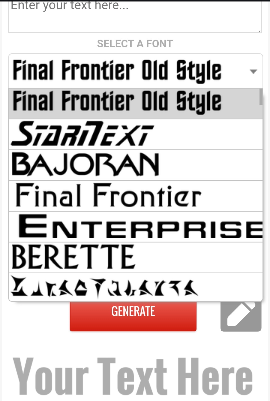
Oh, that’s neat. I’ve seen that site before, but I totally missed that you could save it as a transparent png. That is a very handy tool. Thanks for the heads up!
No problemo. It’s been a lifesaver. Used it today for the Janeway/pupper post.
If you’re on android I highly recommend Pixellab for memes, you can import custom fonts easy, it has layers and just enough tools to make a good shitpost.

