ArchLinux’s pacman with ILoveCandy option enabled.
Ouu, you have me intrigued! Would you mind sharing a screenshot of what that would look like? Never tried pacman, nor heard of ILoveCandy.

The “C” in the progress bar is alternating between “c” and “C” to give the impression of munching.
TIL EndeavourOS enabled that by default. I always thought it was standard…
Nala (an apt frontend) is the best I’ve seen so far
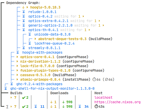
Nix with nix-output-monitor (nom). https://github.com/maralorn/nix-output-monitor

It shows the tree of packages to download and to build. It shortens the tree in realtime when packages have finished downloading/building and lengthens the tree when it finds more packages it needs to handle. Very fun and satisfying.
I haven’t seen this in other package managers.
Very neat, thanks for sharing!
Pacman ofc
I use apt-get, I don’t care about how “pleasing” the package manager is, I just want it to do its job and get off the way… But pacman… I don’t know why, but it’s so beautiful, charming and cute, how do they do it?
exactly. They use
candC(uppercase) alternatively, making it look like pacman is eating. hence the beautiful, charming, and cute progress indicatorbtw dont think im crazy but ive set max parallel downloads to 200 and when i do a system update, damn that looks so good.
You can have actual Pacman emoji for the progress :)
u use it?
How?
Sorry for the late reply, look for ILoveCandy option in the config.
I don’t care how visually pleasing it is either, but I often find apt(-get) difficult to read.
For example, a simple thing that zypper does, is that when listing the packages to be installed, it colors the first letter of each package, which makes it a lot easier to scan through the packages.
Dnf is nice, rpm-ostree not so much.
Nala is the best by far.
Cargo is also nice.
Yeah seriously, I was surprised at how plain and illegible rpm-ostree felt in comparison to dnf, I really wish they put a little color or some extra separation just to make it feel less cramped and give people more glanceable info.
I mean someone can create a PR, would likely be highly appreciated.
I really like emerge/portage, even w/out the “candy” feature enabled. Great color highlighting, and verbose messages about any config change(s) needed.
Portage remains to this day my favorite cli. It’s nice to look at and provides all the info I want.
It’s the one thing I miss from gentoo…
Why miss it? It is still there.
“waves vaguely”
Portage was great but losing a day whenever there was a glibc upgrade or something that caused a more “exciting” upgrade than usual wasn’t worth it. I wanted more stability after a while.
I can’t remember ever having a glibc related update problem.
eselect newsis always there for me. (:I only have rarely a perl update related problem, but usually solvable with a world update. And since there are now binpkgs I only compile what has differing useflags from the selected profile. Portage has never been better!
Stability is for normies, embrace the compile times.
Ohh it’s been a long time since I last used gentoo! I remember I used to love the green/blue (I hope my memory isn’t failing me) combination everywhere </3.
I stopped using it because building the updates on multiple machines was becoming a pain and had a couple of drives fail, but those were good times!
i think you can filter this too. using stderr
Debian made me to only love apt and dpkg.
Omg apt is like the worst UI there is.
Have a look at nala! It needs some depencies but is a huge upgrade
The worst UI?
Clearly you’ve never used
zypper dupHahaha zypper is hell. This must have looked cool when internet speed was slow. But its just horrible.
One of the things that keeps me from staying with OpenSUSE.
That, and its overzealous security policy.
Mind to elaborate? That sounds like a good thing.
It would be a good thing if you want to have stuff inaccessible by your users. Reasonable assumptions when you’re the IT department with the company workstations. Not so reasonable when you just want to have a working PC for yourself (and probably your family).
The other day, I gave up on my Tumbleweed system when an update for some reason rendered my living room PC unable to connect to internet.
Maybe it was done in a good reason. Maybe it’s supposed to give me some protection of some sort. Would I need that protection? Definitely not if it keeps me (and other family members) to watch youtube.
If anyone wants to attack me thru that thing, I’d say go for it. I got nothing but my Netflix & Spotify creds. They can try infecting my media library, which I can just wipe since I got multiple copies of it.
Right now, I got Debian running on all my systems. I get to configure each of them to be as secure as it needs to be without having my operations hindered.
Ah ah i will one day.
I clearly agree, apt is ugly and even synaptic making it better. But like i said, while ago when I used synaptic I did break my packages and I got to use dpkg and apt, to repair.
Since, I guess, I’m on a PTSD about it and now just use apt or dpkg, when using a Debian or Debian based system.
But I will listen to you, and for sure will give it a try
Nala is an apt wrapper, it just displays stuff better, automates updates and automatically chooses the fastest mirror (thats the stuff I know)
Normally like synaptic no ?
I dont know why a (tui) wrapper should cause stuff apt doesnt. Its likely an apt problem.
No that was an synaptic issue, dont remember now the specific issue,
But it didnt managed well, certainly a bug at the bad moment for me at this time XDBut hey i dont regret, i know how to manage a broken apt DB now XD. I guess… x)
deleted by creator
Nala
portage is pretty when i dont mess up my USE flags
Either flatpak or NixOs for me.
Flatpak is just light and doesn’t flood the user with 720710 lines just to say “installing Firefox”
NixOs just straight up has nothing to show.
Fair enough, visually pleasing is subjective, after all. Simplicity can be the best sometimes :=)
I really like the simplicity and formatting of stock pacman. It’s not super colorful but it’s fast and gives you all of the info you need. yay (or paru if you’re a hipster) is the icing on top.
I cannot wait to tell my kids I am a hipster
Portage
Package managers don’t have visuals. What do apt (dpkg) and rpm look like?
Apologies, I meant via the terminal - have edited the title.
pacman with ILoveCandy
pikaur? I love all the colors, especially the bit where it highlights the differences in major/minor version numbers, so it immediately catches your eye (so you can track major package upgrades). I also like that it should which packages are being pulled in as new dependencies.


