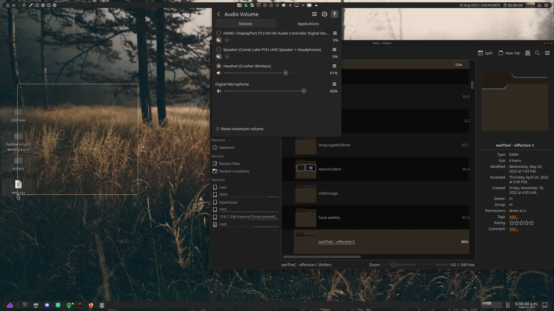
It is 5 am, I have not slept tonight, but what I have done makes me very happy.
It was too easy and took no coding. Even though I’m a professional programmer I was not excited to learn qt and hate c++ with a passion. I did not need to. Seriously, it is my belief that anyone could have done this if they really wanted to
The Problem
I’ve not been able to find a theme which lets me have small floating panels and a nice brownish colour profile. All the brown themes I’ve liked have a massive border radius in the floating panels, and thus my two panel layout takes up an absurd amount of space. 64 pixels in total, though it seems a bit larger to me. Maybe that doesn’t account for the bottom empty space.
Fixing It
I knew at this point I’d have to learn a bit about plasma theming in order to get what I wanted, and had been procrastinating for about a month. Tonight, I could not sleep, so around 2 I decided to try it out. I started online and found nothing on my specific problem, with people suggesting I just “try another theme”. Perhaps I was googling wrong, but no useful information there. went back in to the settings though and found the edit button on the plasma theme section. Right there were all the SVGs needed to alter the theme and a nice button to get to the directory where it was all housed.
I searched up panel, found three images, and tried something incredibly dumb. I just yeeted them into inkscape, made the borders on each image smaller, and changed my theme away and back. Fantastic, now the corners are smaller and I can shrink my panels to a reasonable size. It took about 15 minutes in total. To be fair, each corner was it’s own path and I had to do this 4 times and be cautious of some shadowing but I seriously think anyone could have gotten this done. Fuck man, the theme I’m using is distributed under the GPL. That’s place is wild.
Conclusion
Plasma is built for people who want to change their experience and I love the devs for that. At this point I’d be surprised if I found something I couldn’t do. If you’re curious, here’s the finished product. It’ll take some more work with a colour picker to get the sliders the right way but for now this is fantastic

2am brain: no don’t sleep, go learn plasma theming so you can make the boarders slightly smaller
I love the default Plasma Breeze. I just want to have a usable interface and get work done. But I do LOVE that Plasma can be made to look like practically anything.
Are you me? That’s exactly my thoughts!
I don’t think we’ve ever been seen in the same room, so anything is possible.
I dunno why I didn’t jump on the KDE train sooner, I think it’s default setup is already a better user experience than Windows 10/11, and doesn’t feel like I’m fighting against the desktop like with Gnome.
The ease of tweaking even small things I really appreciate. Feels like an actual upgrade in the UI/UX space from what I’ve been used to from years of hacking together tweaks and programs on other desktops.
you should check out theming in kvantum, same svg principle applied to all the content of the window, and in inkscape turn on the code editor, just the names of the categories is enough documentation
Thanks for the suggestion, that sounds like a very fun timesink. I’ll check it out the next sleepless night I encounter
I recently got back a 10 year old Dell Latitude I lent my brother back when he started high school.
Having no particular project for it, I installed Debian 12 + Plasma 5.27 on it: it’s now 4 days that I’m enjoying tweaking the hell out of itPlasma is amazing. I’m never going back to Gnome and am ready to become a contributor just because I like the DE so much.
Removed by mod
I tried plasma through my steam deck. Its heaven. It has comepletly soured windows for me. I will miss my cracked adobe though. Why did I not jump ship when windows was starting their OS based ads?


