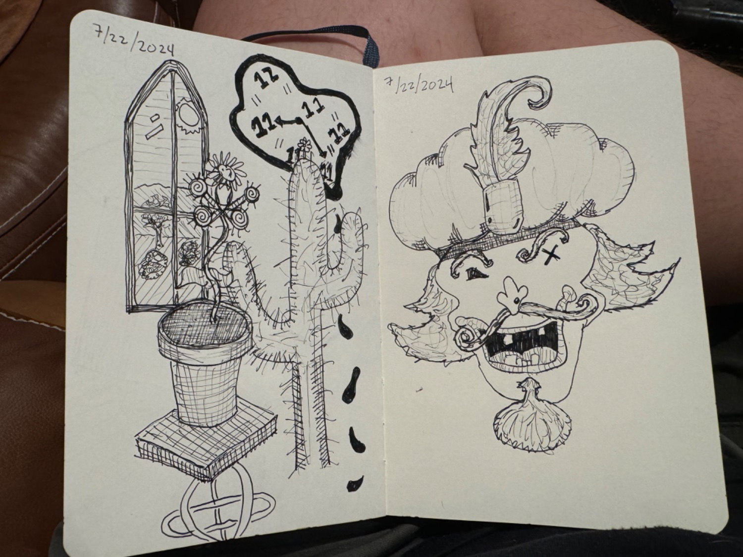
Mysterious, spooky! Love it! Can’t wait to see what else you feel like making!
Feel free to reject what I say as worthless or inapplicable…
Please try doing some no-stark-lines shading art,
perhaps some charcoals or something,
to get you farther into right-hemisphere-dominance mode, RMind, as I call it…
Some of what you’ve earned shows you’re earning some RMind, but the lines-centric stuff is preventing you from getting deeper into it…
just an opinion of some internet rando, is all…
_ /\ _
im sure this is good advice if it was requested, but id avoid criticism without being promoted for it
I’d only be interested in charcoal if it had immediate benefits. It’s sounds like it might.
Right now I am interested in cleaning up line work and creating the impression of dimensionality.
Would adding color be a good way to help legibility?
I feel like I want to avoid charcoal like the plague, but again if it’s a worthwhile investment of time, I guess I could.
Below are some additional examples of what I have been drawing.

Sorry for my delay in knowing-about your reply…
( I sometimes don’t go online for years at a time, to comment )
Yes, adding color increases legibility, outright…
Texture ( for the colorblind ) helps, too, but is much less effective than color, for we who can see it.
Please, though, please try doing some charcoals-in-toothy-paper stuff, & feel the RMind-shift much more easily…
Salut, Namaste, & Kaizen!
_ /\ _


