

If this is a legit stacked bar chart, then the true OP has some serious dedication to the bit. Mad respect.
All images are stacked bar charts if you try hard enough
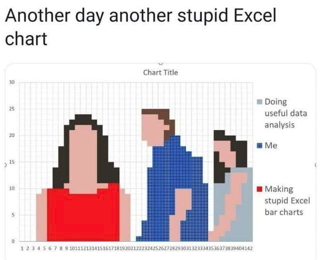
I wonder if they did it manually, or if they wrote some terrible Python code to convert a png to a csv to generate the plot.
I’d wager not too hard to do manually.
The area under the guys face is blank. I’m not sure if it’s possible to stack a transparent colour.
Also the vertical sequence of colours is not the same through the horizontal axis. It could be done, but the right most girl would consist of completely different data than the first two people.
It would be a lot easier to do in other ways.
There’s a white color. You can tell they erased it from the legend
Hmm. I just tested it in Excel. “No fill” will make it transparent. White would cover the grid lines.
So, I guess it’s doable using a set of columns with identical colours. Calculating the values from a picture would also be possible - for a mad man.
Excel-lent
Chart Title
An old meme, with a beautiful new spin.
I’m lovin’ it!

