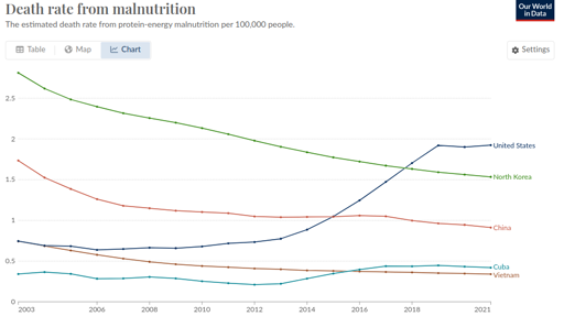
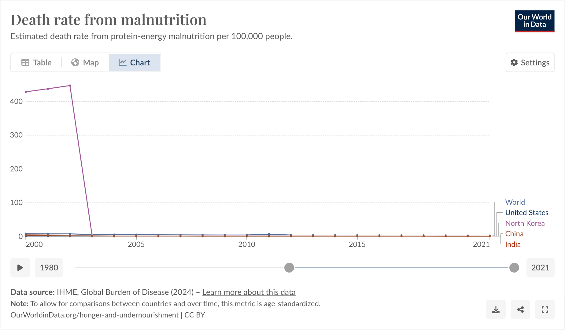
This is a weird one. Bear with me. From [email protected]:

So I said to myself, “that’s a little bit weird. The US one going up, I can actually believe, but the North Korea one being lower is definitely wrong.”
I think Our World In Data is just being shoddy, as they often do.
https://www.wfp.org/countries/democratic-peoples-republic-korea
The thing I found funny, and why I’m posting here, comes from observing why it was that they started their graph at 2003 and exactly at 2003.

I feel like you could use this as a slide in a little seminar in “how to curate your data until it matches your conclusion, instead of the other way around.”
And also, I don’t think the hunger rate suddenly dropped from epic to 0 exactly in 2003, I think more likely Our World in Data is just a little bit shoddy about their data.


But… it’s very rare that sustained international intervention into a basically hostile country to solve a decades-long issue ever even works the way it’s supposed to in the first place, let alone reduces the problem it was trying to address from “crisis” to “totally nonexistent” within the space of one year.
Here are some other stats about hunger in North Korea over time:
https://www.macrotrends.net/global-metrics/countries/PRK/north-korea/hunger-statistics
https://www.researchgate.net/figure/Trends-of-chronic-malnutrition-among-North-Korean-children-by-year_fig2_322157603
I am sure there is variation by how you measure things, which is why those graphs look radically different, but my point is that they don’t shoop down to 0 all of a sudden in one year and then stay there.
My suspicion is that it stopped being possible to get good data in 2003, for some reason, and they just fell back on horrible data instead, which is why the sudden discontinuous change that’s at odds with all the other data sources I could find.
Agreed. And that probably does correspond to actual desperate poverty.