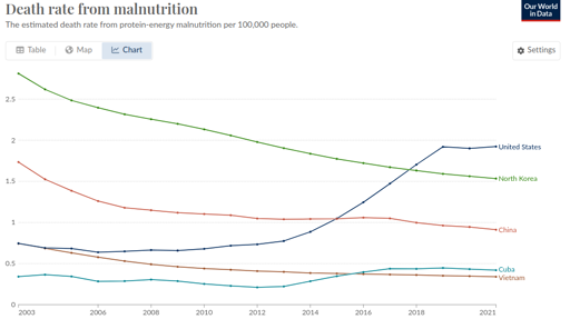
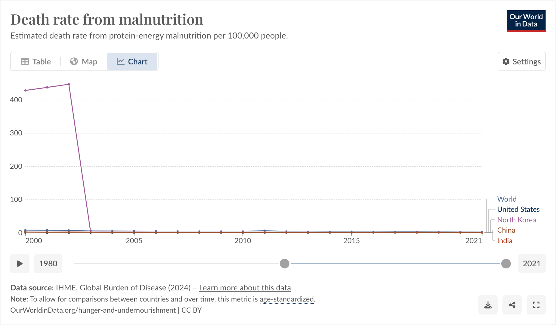
This is a weird one. Bear with me. From [email protected]:

So I said to myself, “that’s a little bit weird. The US one going up, I can actually believe, but the North Korea one being lower is definitely wrong.”
I think Our World In Data is just being shoddy, as they often do.
https://www.wfp.org/countries/democratic-peoples-republic-korea
The thing I found funny, and why I’m posting here, comes from observing why it was that they started their graph at 2003 and exactly at 2003.

I feel like you could use this as a slide in a little seminar in “how to curate your data until it matches your conclusion, instead of the other way around.”
And also, I don’t think the hunger rate suddenly dropped from epic to 0 exactly in 2003, I think more likely Our World in Data is just a little bit shoddy about their data.


This chart is specifically the death rate. The other charts you provided are “affected by” aggregate statistics or “undernourished” if I understand correctly.
It seems possible that NK is improving on people dying directly from it or deaths are being categorized differently (if everyone is malnourished, another more immediate cause of death may be recoreded).
So I’m not sure this is entirely wrong.
All three charts measure different things, yes. I suspect that “Our World in Data” is converting some more complex metrics into “estimated deaths per 100,000” to have an apples to apples comparison, and doing it badly in this case, since their numbers are so different from other sources. It could be also that they just can’t get good numerical data out of North Korea. Some sources don’t even quote numbers because there would be too much guesswork involved.
But I definitely wouldn’t count that, or “deaths are being categorized differently by the government” as a sign that this isn’t wrong. The literal death rate from malnutrition in North Korea is far from negligible like it is in China, Vietnam, or the US (even with it going up in the US). You don’t have 20% of your children with stunted growth without some of them being too weak to make it and dying of some condition due to malnutrition. And that absolutely haunting video of the starving North Korean woman gathering grass, who died shortly after the interview, is from 2010.