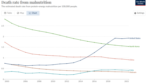
This is a weird one. Bear with me. From [email protected]:

So I said to myself, “that’s a little bit weird. The US one going up, I can actually believe, but the North Korea one being lower is definitely wrong.”
I think Our World In Data is just being shoddy, as they often do.
https://www.wfp.org/countries/democratic-peoples-republic-korea
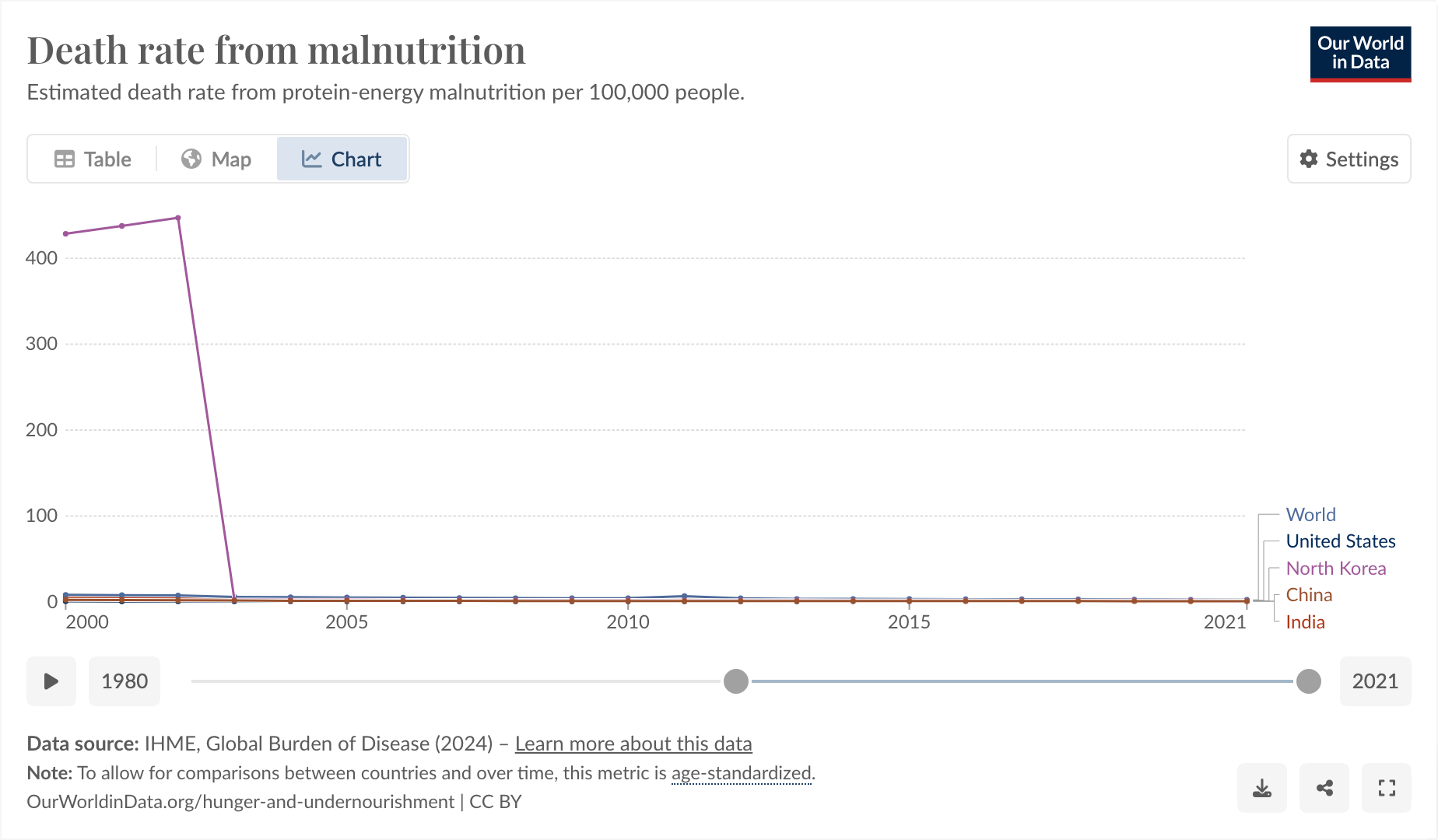
The thing I found funny, and why I’m posting here, comes from observing why it was that they started their graph at 2003 and exactly at 2003.

I feel like you could use this as a slide in a little seminar in “how to curate your data until it matches your conclusion, instead of the other way around.”
And also, I don’t think the hunger rate suddenly dropped from epic to 0 exactly in 2003, I think more likely Our World in Data is just a little bit shoddy about their data.


but ya see, it took 48 years of feeding the starving into the foodschmunkgeneratorium2000™ to march north korean statistics out of the state of starvation with the will and pure physical determination of the people! just not the living
/s