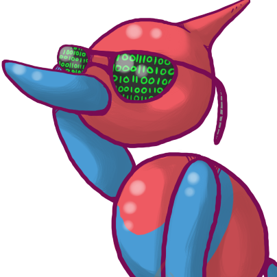

I’m not sure if people care all that much, but whenever I visit this community I can’t help but notice the fairly ugly icon and banner which is clearly AI generated.
Would it be worth updating these? Heck I can make something for the community if needed
You must log in or register to comment.
I agree 100%, both look super ugly
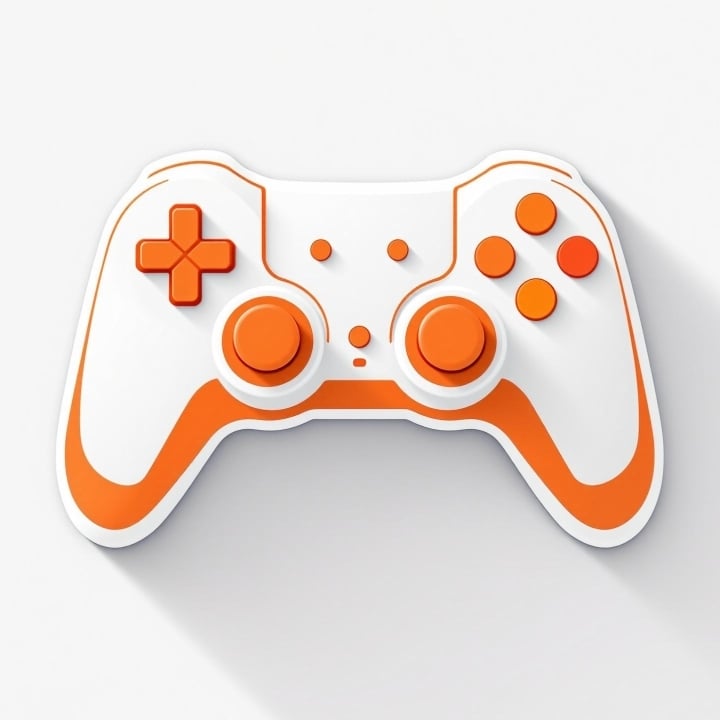
As an alternative, there are tons of gamepad icons on freepik like this one that could be used as long as theres an attribution link in the community description.
Also here’s a quick collage I screenshotted from steamdb, feel free to use it if there aren’t any better ones by others:
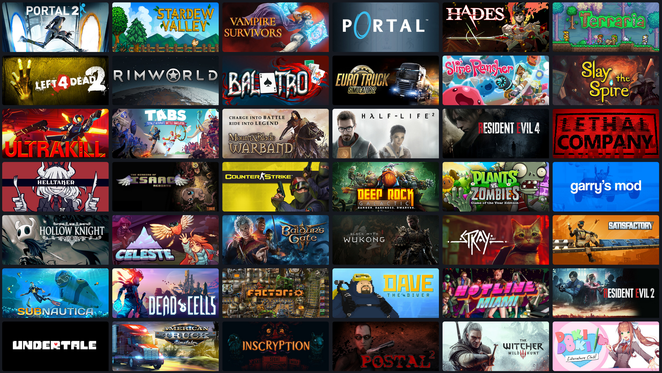
That looks great to me! Would get my vote if the community owner is happy @[email protected]
that site must not work on mobile, every picture posted there is in black and white for me, which makes them look really ugly
The second link works though, as long as I stay on that image
Yeah definitely a mobile thing, because I just changed the filter over to gradient and you can tell there’s slight color involved but everything looks like shown through a dirty glass pane
I love that Banner though
The app I use to browse Lemmy doesn’t show banners so I never noticed but once I pulled it up in browser I agree 100%. That’s a really bad banner.
I’ve never looked that close, but now that I have I’m on your side.
Second that. AI these days: as if nobody here could create a screenshot from its steam library: like [email protected] already did. I bet prompting AI even took longer to create that shitty version of a steam library.
And probably used a shit ton of water and energy for something trivial.
You’re right, they’re hideous!
I kind of dig the icon but yes, the banner is simply awful.
What exactly do you dig about the icon? 😅
For myself, I love the fact that it’s clear that it’s not an actual game controller, however you can tell it is meant to be. This gives the first glance look at a community that is gaming related without defaulting to a specific platform.
I would say that if the game controller icon gets changed it should keep that individuality, meaning that I wouldn’t recommend it become a picture of an actual controller or a diagram depicting an actual controller
Go with a Stadia or Sega controller, both are dead so no issues with people playing favorites.
The colors and it looks like a child’s drawing, which is fun.
Maybe into the fucking hell?
oh holy christ i’ve never actually seen it before just now. it does have a certain “placeholder” vibe to it.
The banner I can see yea I never noticed that before, but I like the community icon, it isn’t a currently valid gamepad(that I can recognize), but gets the point across it’s game related without hinting at a prioritization or preference of system.
If the icon changed I would love if it kept it’s individuality by remaining a fake controller instead of being an image(or depiction) of a real one.
I think one the freepik icons that @[email protected] suggested would be a good idea. They are all fairly generic and most aren’t clearly any one particular controller.
I never go to the community itself, I only browse by my subs. So I never see the banner, and I only see a tiny icon.
I honestly probably wouldn’t notice if either changed.
Just use an ouya controller
Aw, I like the gloopy “name any of these games” banner.