Unfortunately, this graph doesn’t consider that one incident can skew the data strongly because large incidents don’t happen yearly. (And the last incident of this magnitude was This means you can’t infer a trend from this graph alone.
If you include dates back to the 1990s, things look a lot worse then than now.
9/11 deaths are usually not counted, but even when counted the spike is not as noticeable as you might think.
This graph shows data without 9/11, add 265 for the passengers and crew of the 4 planes. I think this graph is also the entire world and not just the USA.
That one bad incident (I assume you mean the helicoptor crash) had 67 fatalities. If you remove it, you still get 19 across 4 accidents, which is still way worse than previous years

![[OC] U.S Aviation Fatalities by year](https://lemmy.ml/api/v3/image_proxy?url=https%3A%2F%2Fcdn.imgchest.com%2Ffiles%2F49zc2kaljpy.png)
Unfortunately, this graph doesn’t consider that one incident can skew the data strongly because large incidents don’t happen yearly. (And the last incident of this magnitude was This means you can’t infer a trend from this graph alone.
If you include dates back to the 1990s, things look a lot worse then than now.
Was 2001 a bad year because of 9/11?
9/11 deaths are usually not counted, but even when counted the spike is not as noticeable as you might think.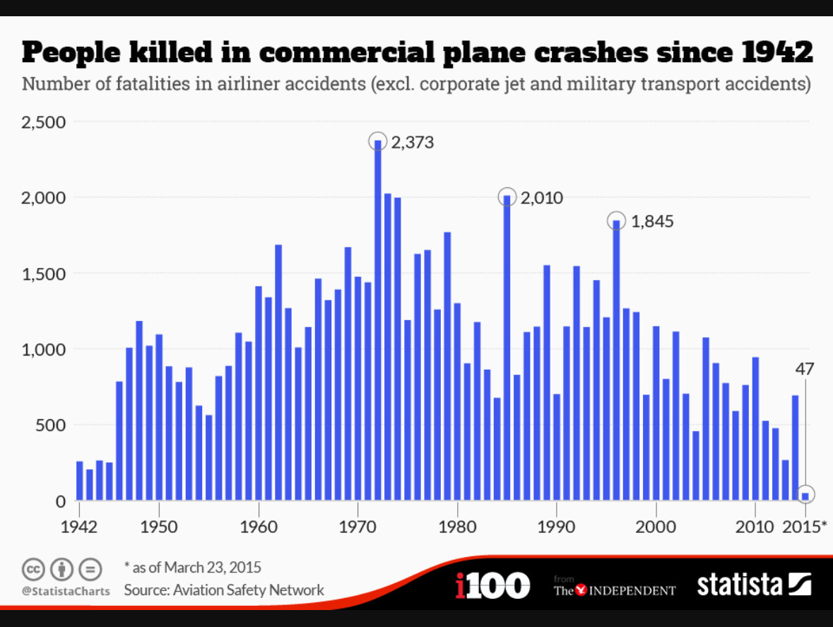 This graph shows data without 9/11, add 265 for the passengers and crew of the 4 planes. I think this graph is also the entire world and not just the USA.
That one bad incident (I assume you mean the helicoptor crash) had 67 fatalities. If you remove it, you still get 19 across 4 accidents, which is still way worse than previous years
But have you considered it’s still only February