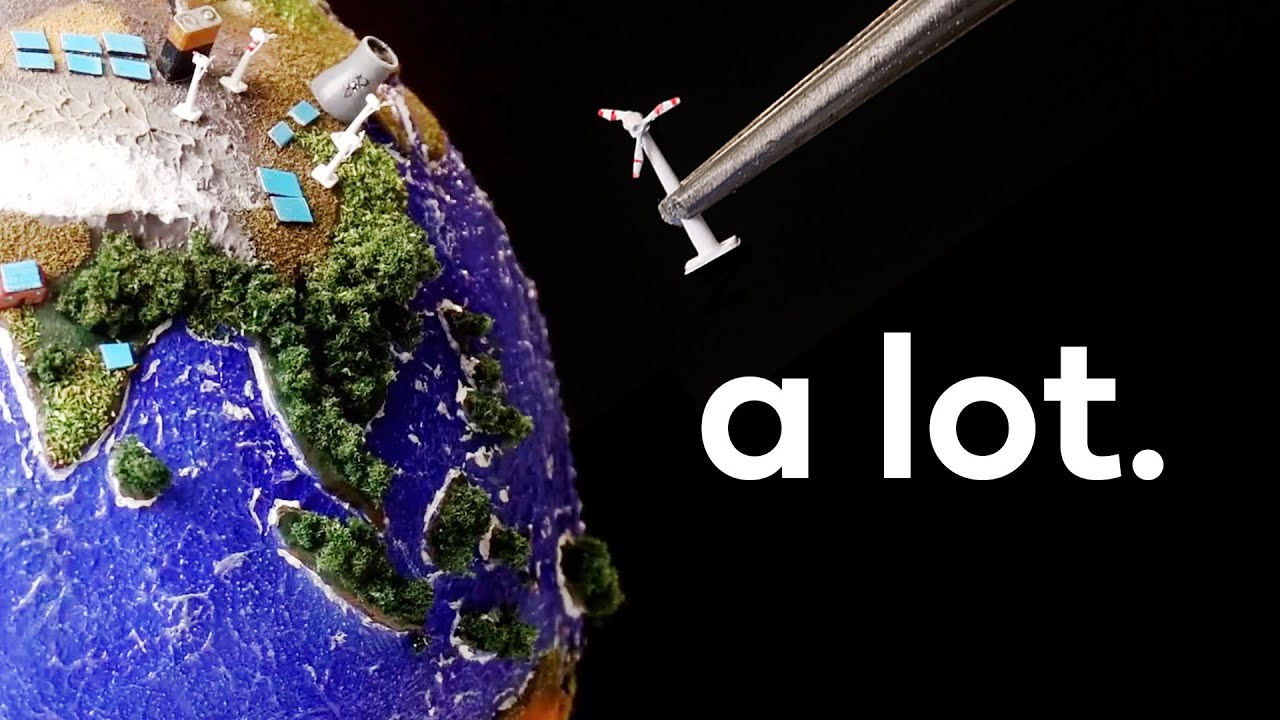
Progress is happening all over the world. I couldn’t fit the entire world into my studio though, so built a model. See how I did that with a Nebula subscript...
Really appreciate this channel’s effort on trying to dispel doomism.
This is disingenuous. To lower atmospheric co2 we need to actively absorb co2 out from the atmosphere while the output of co2 is lower than the absorption. So to even see a progress on this chart we need to first achieve net zero.
I think I need to politely disagree with you on this point.
If co2 emissions were slowing at a meaningful rate, we should be able to see the upward trajectory start leveling off. What we DO see is almost no change in the trajectory of the chart, indicating that current carbon emitters haven’t cut back enough to matter, if at all.
I’m not suggesting that no changes on that line means no “progress”, but one could argue that its not meaningful progress if we aren’t seeing any changes in that trend.
No, we would see an infection point on this chat if we were to make progress, even if we’re not at net zero. The chart would at least be increasing at a decreasing rate, as opposed to the current trajectory increasing at a steady or even increasing rate.
Actually, since 2020 the curve looks linear rather than exponential, which does match what he says on the video that we might have stopped increasing emissions year over year. Obviously this is not enough, but it is progress.

checks atmospheric carbon dioxide
No progress.
This is disingenuous. To lower atmospheric co2 we need to actively absorb co2 out from the atmosphere while the output of co2 is lower than the absorption. So to even see a progress on this chart we need to first achieve net zero.
I think I need to politely disagree with you on this point.
If co2 emissions were slowing at a meaningful rate, we should be able to see the upward trajectory start leveling off. What we DO see is almost no change in the trajectory of the chart, indicating that current carbon emitters haven’t cut back enough to matter, if at all.
I’m not suggesting that no changes on that line means no “progress”, but one could argue that its not meaningful progress if we aren’t seeing any changes in that trend.
No, we would see an infection point on this chat if we were to make progress, even if we’re not at net zero. The chart would at least be increasing at a decreasing rate, as opposed to the current trajectory increasing at a steady or even increasing rate.
Actually, since 2020 the curve looks linear rather than exponential, which does match what he says on the video that we might have stopped increasing emissions year over year. Obviously this is not enough, but it is progress.