I wanted to try inverse clouds with black instead of white. It really muted the blue color and darkened them more than I expected. I don’t think they look bad but I’m kinda surprised at how much attention they are getting from people I show them to.
I wanted to try inverse clouds with black instead of white. It really muted the blue color and darkened them more than I expected. I don’t think they look bad but I’m kinda surprised at how much attention they are getting from people I show them to.
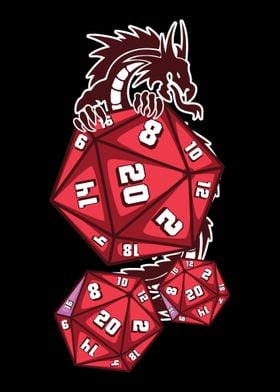
Not the most readable but they do look cool
I haven’t done the numbers yet.
They will look wicked af once the numbers are painted tho,
The numbers haven’t been inked yet.