

![[userscript] (grease/violent/tamper) *monkey script to reformat Lemmy's look and feel to old.reddit with RES](https://i.imgur.com/RXo5aVT.png)
userscript called “old.reddit” found here: https://github.com/soundjester/lemmy_monkey
-
(recently updated for Lemmy v0.18)
-
This is primarily for desktop clients. At the moment, formatting get a little crazy below 1280 px wide. There are ways to address this, but I have not at this time.
-
script will be updated as suggested
- significant changes have been made to address alignment, spacing, and other format issues. v1.1 will be where I stop for a while.
-
there are two script versions: old.reddit and old.reddit.compact. The primary difference is that the “compact” version greatly reduces thumbnail size and padding space.
-
notice: current script unblurs NSFW
(linked thumbnail shows old.reddit.compact version of the script)
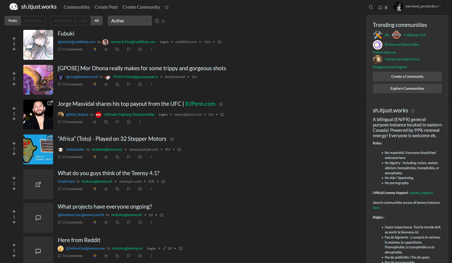
Screenshot of old.reddit script results:
I don’t want to pat myself on the back TOO hard, but I just browsed through 44 pages of content and it was SO NICE and easy on the eyes.
The widescreen really makes a difference.
modded you
Nice, thanks. Not sure I’ll want to stay a mod if this picks up however :D
lol why not?
and leaving is ez, there’s a “leave mod team” button on the sidebar below the community name
I have way too many responsibilities as it is, can’t add another in good conscience, that’s all
alright, no problem :)
dude… the screenshots don’t do it justice, it’s a beautiful thing. :) the experience is much better than i imagined.
nice job team! @[email protected]
Nah man you can pat yourself. My 4k resolution is finally utilized and I am very happy with how almost everything looks.
Some community headers get scaled pretty wonky, for example in https://sh.itjust.works/c/[email protected] but thats a small price to pay for more visual clarity overall.
Thank you for the great work!
I added a line to restrict the banner width to a lemmy-native 730px - this should keep banner images looking as intended… Check out the update and see if that fixes the issue. (link for good order: https://github.com/soundjester/lemmy_monkey)
Wow that was fast! Although I’m not 100% sure its better (for high-res at least).
Here’s how it looks for me on a 3840x2160 resolution and 110% zoom:
But I think I understand the technical reasons beyond your change. It should be universally applicable and not just on 4k res.
I think it still would look best if the banner is spanning the whole top, maybe up to the community-sidebar on the right (1) or even beyond that (2). I tried to highlight 1 & 2 in this poor greenshot cap :)
Anyway, thanks for your great work!!
I think having a slim banner is better, because it takes away less precious space on smaller screens. Remember that not everyone has huge monitors, many use web browsers on laptops and the like.
I absolutely agree that a wider, somewhat shorter banner across the top would be best. My current logic is that most mods do not have this userscript and rely on the limits set by the default stylesheet. So they upload images optimized to fill a 730 x 240 space.
The line that controls this in the script is line 75:
GM_addStyle(".position-relative.mb-2 { max-width: 730px; }");if you take that out and replace it with:GM_addStyle(".img-fluid { height: 180px; }");you’ll have something closer to what you want. It’ll still look strange tho (IMO)^^ do not do this ^^ I was wrong
I’ve just tested it. the GM_addStyle(“.position-relative.mb-2 { max-width: 730px; }”); is definitive the way to for now. I think you are spot on with the banner size.
yeah. this also has the happy effect of “correctly” formatting profile banner pics as well…
Yes. I’ve also looked around a bit in different subs and many of them dont even have a banner wider than a few pixels. I guess thats as good as it gets as long as there are no specified banner sizes enforced all across the network. And of course not everyone uses your glorious script (but I’ll spread the word, its really really cool!).
all throughout doing all of what I was doing, I forgot to test your awesome script??? lmao im a retard, doing it now.