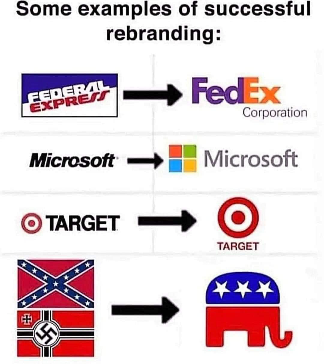
Flying Squid to Political [email protected] • 2 months agoRebrandinglemmy.worldimagemessage-square49fedilinkarrow-up1966arrow-down136
arrow-up1930arrow-down1imageRebrandinglemmy.worldFlying Squid to Political [email protected] • 2 months agomessage-square49fedilink
minus-square@[email protected]linkfedilink21•2 months agoit’s nostalgic, but it’s a fucking horrible logo
minus-square@[email protected]linkfedilink5•2 months agoEspecially since there was no way to shrink it down and have it look good on the computers of the time, back when 640x480 was the norm.
minus-square@[email protected]linkfedilink2•2 months agothere was an icon form that had 4x5 trailing squares instead of 6x7… commendable, but still noisy.

92-94 is GOAT for me
it’s nostalgic, but it’s a fucking horrible logo
But it is wooshing! With solid primary colors!
More pixels bro
Especially since there was no way to shrink it down and have it look good on the computers of the time, back when 640x480 was the norm.
there was an icon form that had 4x5 trailing squares instead of 6x7… commendable, but still noisy.