

Here is a gray scale version of the image with better contrast.

Graphic design is my passion ✨️
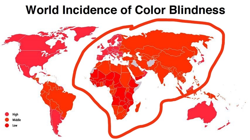
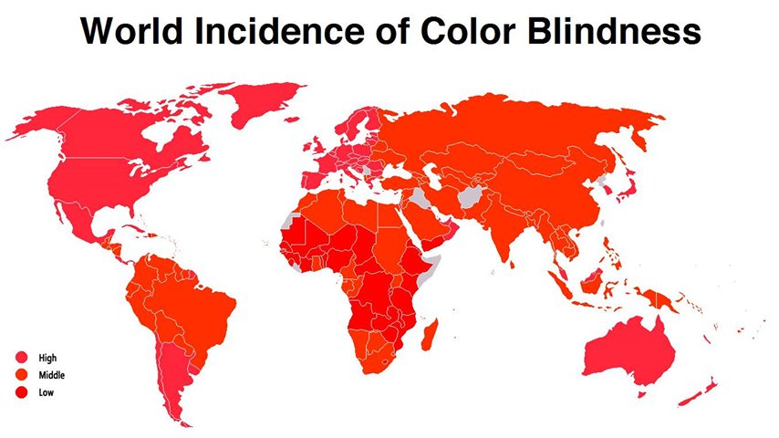
Those are actually different colours. But there’s not much in it.
Low is red, middle is orange and high has a pinkish hue to it. It’s easier to see on the map itself but you can sort of tell on the key. I don’t think the compression helps but it is different.
Oh! I thought the joke was that you, the reader, are colourblind because it all looks red.
That’s the joke. And yet, they are slightly different colours.
Trying to think of what North Korea, Taiwan, Afghanistan, Iraq, Somalia, Serbia, Western Sahara, and Liberia have in common?
Poverty?
How old is that data?! France and Ireland should absolutely be red as of now. And don’t get me started on Germany. Can someone please update this horribly outdated map to 2024?
It’s just because higher developed countries have diagnosed it, right?
Probably, that seems to be the case with a lot of medical issues. It’s not that they are becoming more frequent, it’s just that we are getting better at diagnosing them.
So, I guess it just looks like the denser populated regions are more orange, leaving places like Antarctica and Greenland a pure lavender
Unreadable! Needs even more jpg compression!
Oh no
Hi there! Looks like you linked to a Lemmy community using a URL instead of its name, which doesn’t work well for people on different instances. Try fixing it like this: [email protected]
Hi there! Looks like you want someone to link a Lemmygrad community using its name instead of a URL, which doesn’t work for people on defederated instances. Try fixing it like this: https://lemmygrad.ml/c/alwaysthesamemap
Does anyone else think that Europe, Asia and Africa look like a dude with some funny looking shades and a funky haircut?
You might have to do a line drawing of that for us to see it! :)
Really? Can’t see it?
Not in the slightest, I can’t even work out where his shades are or what direction he’s meant to be facing etc - though I expect as soon as I’m shown I won’t be able to see ot any other way :)
I’m on my phone, I could do it in more detail if you can’t see it.
Haha, yes, circling Europe, Asia and Africa isn’t helping much - I already knew that bit :)
Which way is the face facing? Where’s the eyes and mouth etc?
OK, I’ll try again 😂.
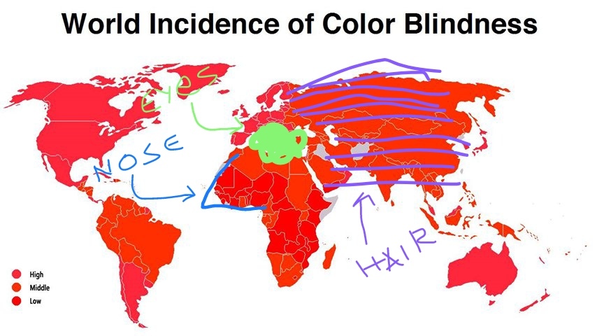
Hahaha! That’s brilliant. I honestly never would have found it - I think I’m so conditioned to just see that map as “Europe and the continents next to it” (or “Crusader Kings II Background”), that my brain wouldn’t allow me to abstract the image :)
If most of Asia and Europe are his hair, then I see it!
Yes.
I’ve seen this image in that way ever since I was a kid. The weird looking man, that’s what I used to call it when I was a kid.
Why is it all just blue?
I am sorry but Europe is blue and should be pink
deleted by creator


