

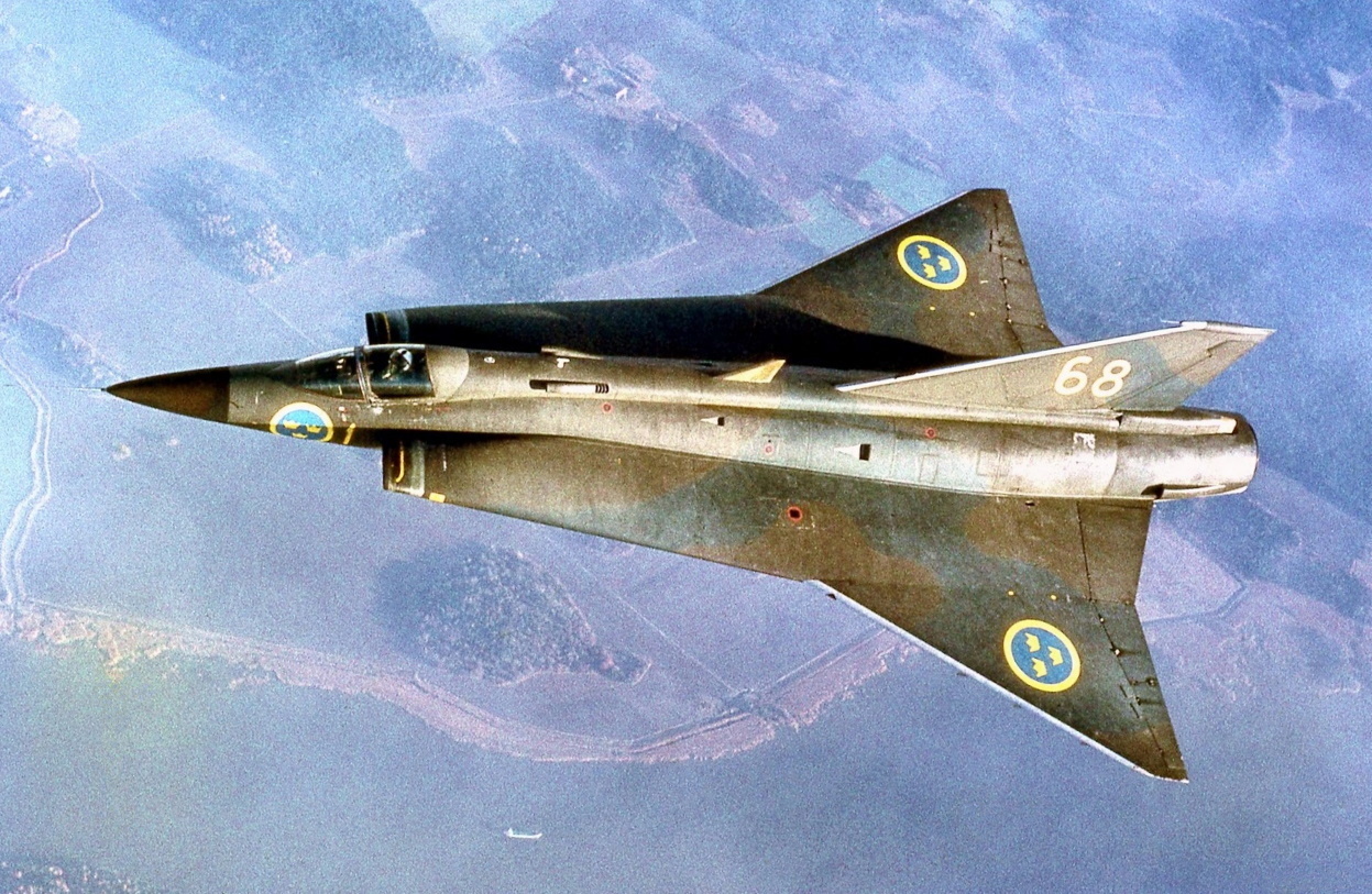
Pretty sure 4 of those are Linux distros.
And a few defunct airlines.
And some racing teams.
I was gonna ask!
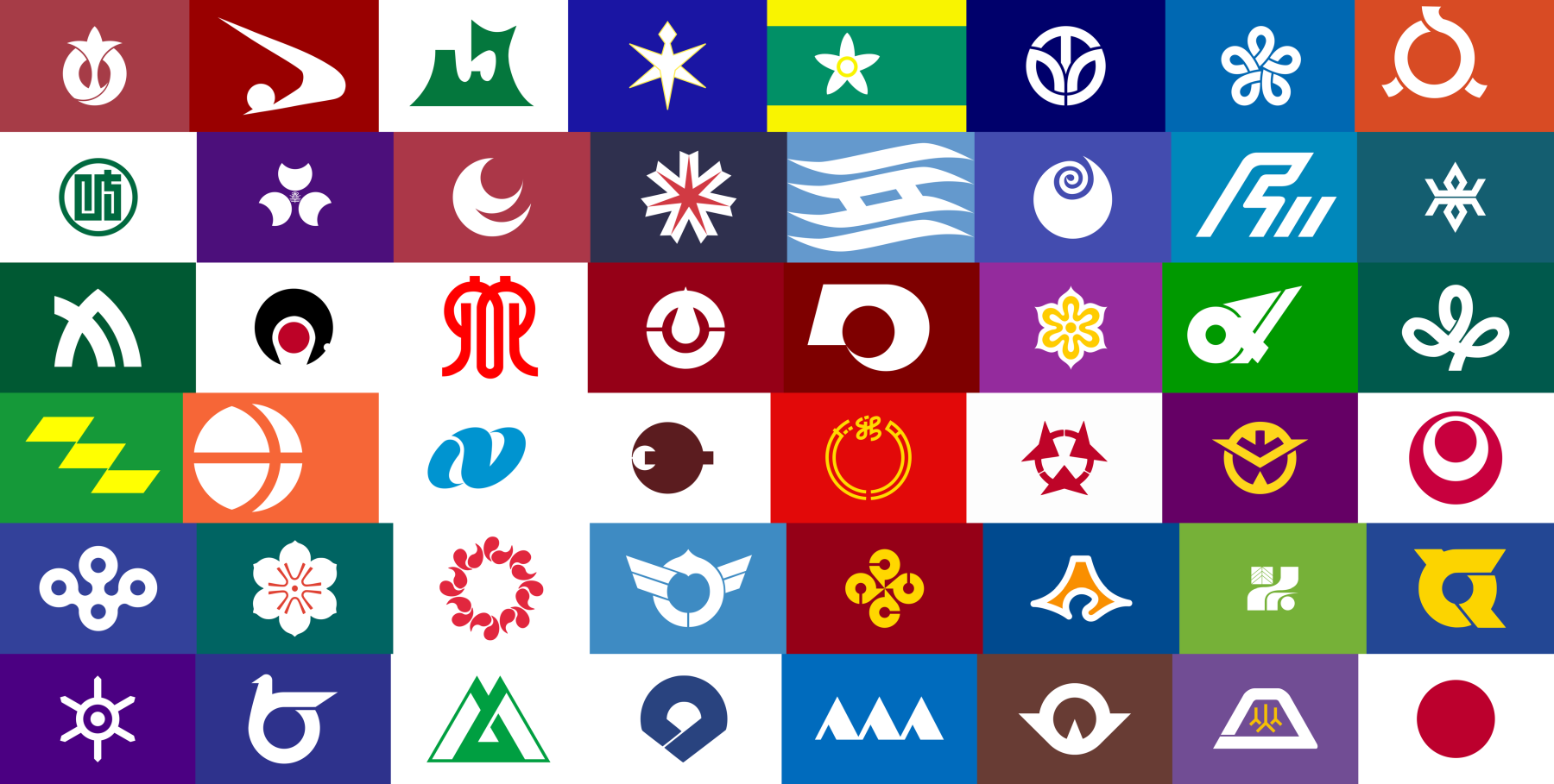
Top right is the Ubuntu logo. Top green-yellow one is some African country. Bottom one in blue with three triangles is some fancy hotel brand.
Third row, second column. Tau Empire.
It’s a shame that they aren’t more popular; I didn’t really see prefectural flags flown that much outside of government buildings when I lived in Japan.
Top right one looks like a Linux distro logo, so that’s pretty cool I guess
The Niigata one reminds me of the General Electric logo
These look extremely corporate, like hotel chains.
I don’t know which prefecture is attached to the flag but third row, last one to the right, the clover-like one.
Edit; it’s the Miyagi prefecture.
Bottom left- “et pluribus anus”
Far right column, fourth one down from the top. I like that it’s a visual pun on the Japanese flag; the little red dot on a white field inside the larger dot effectively depicts a little Japan inside the larger nation, a microcosm of the nation itself.
It’s a very effective vexillological distinction of a part within a whole, while still maintaining the effect of the original flag design.
I also find it funny that it seems to be a flex on all the other prefectures, this flag subtextually implies, “We’re the most Japanese prefecture that has ever been, we are the essential core of this nation and our absence would leave a blank empty void. Don’t fuck with us.”
Definitely AG Systems
Fukuoka for symmetry, Aomori for their flag being a stylised map of Aomori, and Miyagi because it would be fun to draw.
hokkaido!
6 across, 4 down. The one with the arrows.
I never would have guessed that’s what any of these are


