
- cross-posted to:
- [email protected]
- cross-posted to:
- [email protected]
You must log in or register to comment.
They are the same picture?
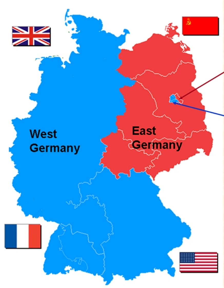
Yeah, the AfD is the nazi party. Nazis happen when people are in a bad financial situation. And former East Germany still is in a worse financial situation than the West, hailing all the way from being looted and isolated after the war, to young talents moving into the West to find jobs after the reunion happened.
There’s also an argument to be made that not many immigrants move to the rural areas in the East, because well, if you’ve got the choice, why move there? As such, it’s a lot easier to rally people there with racist talking points.
Yep and its probably gonna stay that way. You can apparently still see differences in voting behaviour, happiness and life expectancy between both sides of the Roman Limes wall.
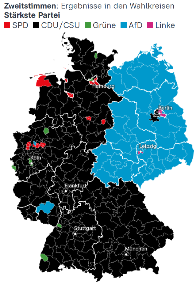
it’s that plus a population map to some extent, with the large population centres as usual leaning more left.
And/or a little less right
Both main colors are equally depessing.
Thats a really bad representation of the election results. Binary brain is strong with whoever made that.
The best way would be a gradient that shows how left or right leaning the result was overall. This just shows the largest party, but nothing about majorities.
That is the representation of the second vote.
In Germany you have two votes: One for a local representative, the second for the party List/ percentage representation in the Bundestag. The map shows the strongest party in each district according to the second vote. It serves to highlight trends. The overall election result is here: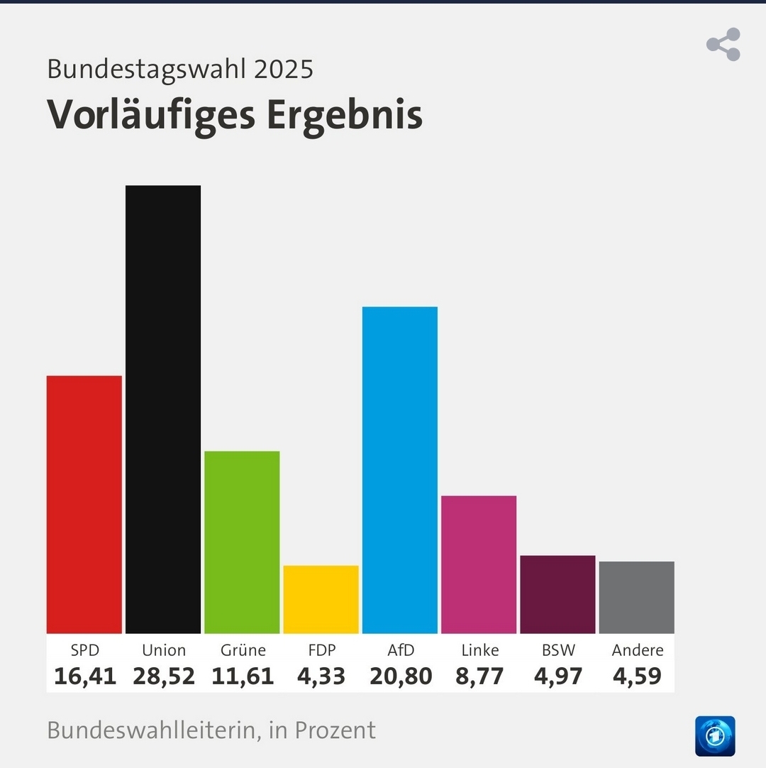
You can represent those colors per district tho. Just line all the parties up from left to right, weight them properly and then calculate the average value to get a number for how left or right leaning the whole population voted.
For the national result for example you could give the parties these arbitrary ratings for how right or left leaning they are.
- Linke: 1
- Grüne: 0.6
- SPD: 0.2
- Union: -0.3
- AfD: -1
Then you multiply those by their percentages:
- Linke: 8.77
- Grüne: 6.97
- SPD: 3.28
- Union: -8.56
- AfD: -20.8
Take the sum, divide by 5 and you get roughly -10% which gives you a great idea for how right or left leaning people voted. Im dumb af, those numbers are all wrong and i dont know how to do math and statistics but surely smart people can figure out a better way to represent voting results than “PARTY WITH MOST VOTES”
But that requires full subjectivity or an arbitrary set of standards to weigh how left/right everyone is. Not what you’d want in impartial reporting, and fails when you can’t easily characterize parties on a left-right spectrum. Where would the BSW go, for example? Anti-immigration, anti-queer rights, but nominatively pro-workers rights and for wealth taxes?


