- cross-posted to:
- games
- [email protected]
- [email protected]
- cross-posted to:
- games
- [email protected]
- [email protected]
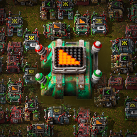
Readability of the combinations themselves from the standard view still sucks. I hope they address it. It’s really hard to tell which combinations are connected and where, especially on compact setups.
The fact that the combinators are green with green and red wires included in their sprites is just a recipe for confusion.
I can’t imagine how bad it is for anyone with colorblindness.
I believe factorio has a colorblind mode
But i completely agree, whenever i’m building something more complex and something is connected in orrectly, it’s easier to tear up the whole thing and starting over than trying to track down the incorrect connection…
Agree it’s an issue, but in my builds most of the complexity in telling how things fit together is because of chains of several combinators.
It looks like the update is going to allow for much more complexity to be expressed in a smaller number of combinators, which should mitigate the issues somewhat.
As a software dev, the biggest thing for me in this update is that it makes combinators more like how I think of things in terms of programming paradigms. When I first came across combinators, I tried to treat them like logic gates. Eventually, I realised they’re a different thing entirely.
Using the circuit network has always been kind of tedious, so I’m glad to see that it is getting some love for the 2.0 update. Showing the input and output signals directly in the UI and being able to have a description for the combinators is going to make debugging much easier.

