
Millions of dollars and a team of some of the world’s best designers and this is what they came up with?
You must log in or register to comment.
It’s giving ඞ
I’m so conflicted rn. On one hand I hate Facebook but on the other I love cinnamon buns. Random app idea (you’re welcome), app on home screen and when pressed places order of 4 cinnamon buns for delivery. “Piping Hot Buns” coming soon to iOS and Android.
I support this completely; donation may or may not be forthcoming
On the one hand, this is just Doordash/ UberEats with less functionality, on the other cinnamon buns. Mmm cinnamon buns…
You say less functionality, I say faster workflow. Why go through all those extra taps and menus just to pick out cinnamon buns?
Oh my. That’s craptastic. Looks more like grandads silvery pubic hair on a dark colored toilet seat.
Probably equally joyful to discover.
Oddly specific analogy. I’m sorry you had to experience that 😔
Don’t go in there after grandad. The smell of an old mans ass, smell of a hemorrhoid cream and heat on the toilet seat, tells you a tale.
It looks like a turd viewed from above. Or a pubic hair stuck to a shower wall.
Seconded, I also saw a turd
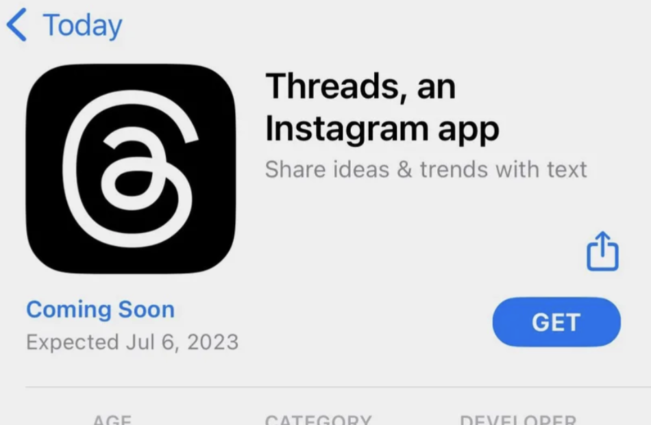
It took me a moment to realize that this is the new Meta thing. At first I thought it was about some new client app or something.
THIS is their actual logo? Who’s kid was commissioned for this masterpiece?Hey man give more respect to cinnamon buns
Looks like something a kid drew up for a second grade art project
lol, looks like they just
ripped offused the ol’ @ symbol, used a two-story ‘a’, made the loop go the other way around, and simplified to a curvy line… really curious how much they spent to come up with this. could have at least used the letter ‘t’ or something. or their little infinity symbol… totally agree there’s unintended images I see in this.edit: commenter is correct, thank you
My first though was oh look email for dyslexics!
It’s not “ripped off” when that’s exactly what it’s meant to be
I’m confused how it relates really it has no resemblance to the name or brand, kind of to mentions I guess??? It looks terrible
I actually don’t think it looks TOO bad. But in not sure what it means.
While writing this I figured out its an ‘a’ @ symbol. Instead of following the one line, it uses the a with an overhang
I don’t know about you, but it looks kinda sus ඞ
Looks like the Tamil language alphabet கு .
Pig’s ass.
How much in total labor hours did it cost Meta to make this logo?
Bonus question: how much of that time was spent directly or indirectly preparing, presenting, traveling for, or viewing the presentation of Microsoft PowerPoint slides?
None because stuff like that is made by an advertising agency for a 5-6 figure sum.
Looks like the view from above the poop emoji like a more messy version of the Ubisoft logo.
It honestly conveys it’s a trap


